AM Design: Rebranding and renaming
I’m back writing on my blog (for the happiness of my 0 followers) and I’m back writing about my personal rebranding. After years wavering I arrived to a decision.
ADR turned into Adriano Mescia Design, shortened as AM design or just AM. Initials are mainstream and predictable, but they just make more sense than the first three letters of my name. Plus, ADR it’s used by Rome Airports (Aereoporti di Roma) and since I hate them, their shoddy service and their pointless website (it’s the only airport website in the world which doesn’t give real time flight info) I really don’t want to have anything to do with them. Furthermore, AM it’s easier to say and sounds better than ADR.
![]()
This one is my old logo created when I was still under the influence of my teenage years passion: punk rock. It was indeed inspired by the NOFX logo which I mixed, aiming to make it look a little more serious, with some touches of the Sky logo (a weird logo for me, which I didn’t like at all in the beginning, but that then I started to appreciate for its simplicity and adaptability in various colours and contexts).
![]()
![]()
I liked that logo for a month maximum (the time to create all the collaterals), then it soon started to look a bit too thin and fragile. Characteristics which gave readability problems, especially in small sizes. Since then I’ve been promising myself to rebrand, to build a decent website and to realise an ultimate nice portfolio, but if you’re a designer or anything similar surely you know that works for yourself come always last…especially the portfolio. Nobody likes to do a portfolio, to re-enter a project you finished ages ago, to re-open disconnected links, half deleted and weirdly named files, to sort everything out, to summarise what’s actually useful and to eventually realise that your past was not that bright as you remember…Well, I haven’t rebuilt my portfolio and website yet, but at least I came up with the rebranding. That’s a milestone folks.
1st IDEA
I decided to go bold and serif.
I tried millions of stuff, but this one is the first idea which actually convinced me. I quite liked the effect of Charter font with a tracking of -75. I liked the boldness and simplicity which granted its adaptability. In fact, liked it standing by itself, next to an image, over an image, as a watermark, with graphic shapes, but not too much in combination with a sans serif font.
I considered to go all serif, using a serif font for all my materials, but the idea was soon discarded. Besides it’s well-known web incompatibility a serif font would look “old” and boring in too many occasions. Therefore I tried combining a serif and a sans serif font, starting a research for “the perfect sans serif font” to combine with Charter.
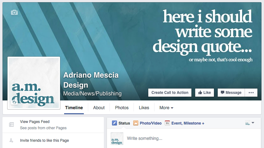
In the meantime, I kept the logo on my unpublished company Facebook page, so I could keep looking at it and see if I was getting bored of the Charter font itself, which wouldn’t have solved the problem, but at least open my way for a complete reboot.
Eventually I didn’t get bored of the logo, but after a few days I started to notice that it was looking too much like The Guardian logo, or anyway like a newspaper logo. All right then, change that bloody serif font…
2nd (AND FINAL) IDEA:
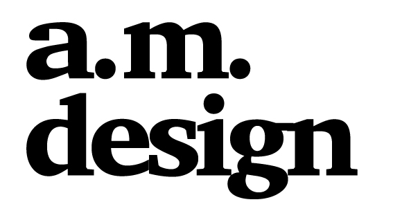
Besides the serif font, I looked at features which didn’t convince me much in the previous logo and the prominence of the word “design” is surely on those features. Thus, I opted for a simple lettermark made of my initials, to combine potentially with a smaller word “design”.
A whole text logo (in jargon wordmark or logotype, since they are composed entirely from “type”) wouldn’t have worked, my surname is nearly impossible to get right for not italians speakers, and my name doesn’t perform too well either, too exotic for most of the Anglo-Saxon speakers. I want people to read correctly at least the logo…
A brand mark, that is a logo composed only by an icon or a symbol would be problematic, I’m of the opinion that this choice can be taken only by well-known brand, like Apple or some car brands. To find confirm of my theory I even found this brilliant article, in which the author, Vladimir Gendelman, says:
“a brandmark logo type can be a risky move. Since it’s only a symbol, a person looking at it won’t be able to see your company name […] That means it might not be the best choice for a new startup or a smaller company that’s trying to get people more familiar with their brand.”
In the article he also mention two more kind of logos: combination marks (text and symbol) and emblems (text inside the symbol). Well I haven’t considered any of them, I reckon that the first one might have been too corporate, while the second one is just an ancient solution.
How should I do this lettermark though? Should it be an artwork? A customised font? An ordinary font? An self-made font? A wordart? Ok, definitely not a wordart..
To get inspiration I started to look at different kind of fonts on MyFonts, I was lazily looking at the website without finding anything convincing when I started staring at their very logotype.
![]()
I appreciated the combination of the sketched font and the rest of the sans serif font used on the website. Plus, I tried to envision a simple logo like that in various contexts, not exactly a font, neither a symbol, not bad…
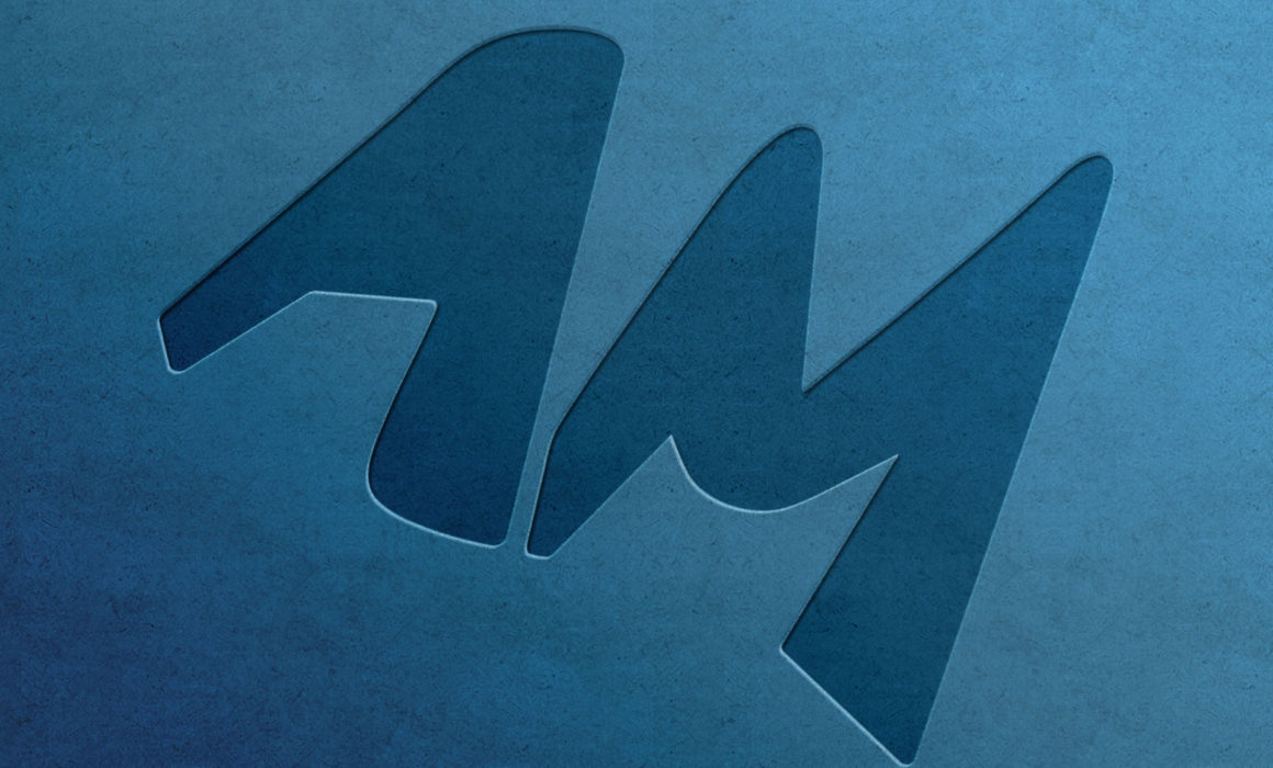
Hence, I opened Illustrator and just quickly sketched with the pen tool a random A and M. I liked it. That could work. I tried it on some collaterals, on images, in combination with a sans serif font…man, it works! Habemus logo.
![]()
I tried it also with the Design text below, still quickly sketching on Illustrator without any pretension. Not bad either, I might change that in a not so far future, but it could do for now.
![]()
Now let’s finish the brand, let’s find the official sans serif font and we’re done. Easy, isn’t it? Not really…
FONT:
The font I used on most of my materials so far is Avenir, in combination with Avenir Next Pro Condensed.
I thought about changing that, I checked many fonts and the finalists were: Source Code Pro, Alegreya Sans, Fira Sans
I therefore tried these fonts on different materials, but despite everything Avenir kept the champion belt defeating all the three finalists…it was still looked like still the best solution, but there was a problem Avenir is quite expensive. I mean, I could afford it, but knowing myself surely in a few months I’d like to renew my brand so the choice of paying loads of money for a font it’s just not sustainable.
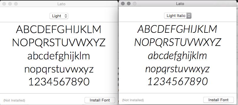
So I had to find a font similar to Avenir, I checked different forums to see what could have been the right substitute, I also checked some weird “closest fonts finders app”, but nothing in the end convinced me more than Lato, the font I used on my blog for over a year, which I didn’t even chose in first place! It was the default font of the WordPress template Twenty-fourteen which I picked in all hurry when I started uni.
So done…ah no wait…I was about to officialise it, when this article arrived in a daily newsletter I’m subscribed to “Designers’ favourite typefaces” and, of course, I was so dumb to open it…
Honestly it didn’t go too bad, only a font really catch my attention: Montserrat.
That left me undecided for a week. I had to do the typical comparison game, trying the two fonts on different collaterals to finally arrive to declare the winner, which eventually was, once more, Lato.
Montserrat it’s great in bold, it has nice features, the G is just awesome, but it’s too wide in lowercase and slightly too particular, feature which might annoy me on a long run. Anyway, the real winning feature was the Italic version of Lato, which Montserrat doesn’t even have at all.
COLOURS:
Finally I had to change the colours, that 100% Cyan turned out to be boring, too bright, difficult to combine with other colours but greyscale and, most of all, being one of the four CMYK colours related me inevitably to printing, making me a designer focused mostly on printing (which I was at the moment of the creation of the previous brand, but not anymore).
I like blue though, so I decided to keep the colour, but just to variate some percentages. The colours testing went on for a while and from it I picked two colours: a dark blue which could completely replace the black (I tend to use black as less as possible overall in all my works) and a very light blue with some tones of green, light enough to stand out, but not that light to not be readable on white. Having a brand colour which can’t be used on white turns out to be always difficult to use.

Dark Blue:
CMYK: 100, 0, 0, 90
RGB: 0, 35, 55
HEX: #002336

Light Blue:
CMYK: 51, 0, 18, 0
RGB: 132, 204, 214
HEX: #84ccd6
Done! Now it’s really time to redesign this ugly blog I’m writing on.
(if you really read until this point I’m really grateful for you patience and good will)
Nice work AM! 🙂 Really like the new logo and font you’ve chosen. Colours are so much better indeed than the Cyan. Looking forward to seeing more of your branded materials. How about some mugs for the office? 😉
Thank you! Glad you like it, I know you never fancied the Cyan 😀 Some mugs for the office are a good idea, they are never enough