SidM Systems
Social Infrastructure Demand Modelling
SidM Systems is divided into 3 sections: SidM Housing, SidM Health and SidM Education. The first one concerns housing developments, the second one provides demand projection for GPs linked to population projection and the third one for schools. So far only the first two sections have been developed.
I designed the entire software interface from scratch. In an initial stage I also coded in HTML and CSS (and occasionally some functionality in Javascript) the interface and the sidebars which were then integrated by backend developers. After that, as the project size increased and with that the team. I took the design lead and left all coding to developers.
The work is still in progress as the areas of interest and the functionality are in continuous expansion.

The problem
Planning and management tools are archaic, locked in departmental silos, fail to give direct answers to complex questions.

• Inequality of distribution of services

• Bottlenecks in service provision

The user journey
Planning and management tools are archaic, locked in departmental silos, fail to give direct answers to complex questions.


Large mapping component
Users had to navigate on the map and access data, as per Google Maps

Content scalability
We started with the Health sector, but the aim was then to expand also to other sectors: Housing, Education, Utilities

Geographical scalability
We were starting from the London Borough of Hackney, but it had to have the potential to expand to all the UK and beyond.

Data visualisation
It had to show geodata in an easy to get way.

Minimum scrolling
More things as possible had to be displayed on one screen, without having users to scroll down.

Innovative but formal
The tool was going to be used by office clerks used to work with tables all their life. So it didn’t have to be playful.
Competition research
Despite there wasn’t a real competitor we analysed some map based softwares reporting data that could be useful as reference.


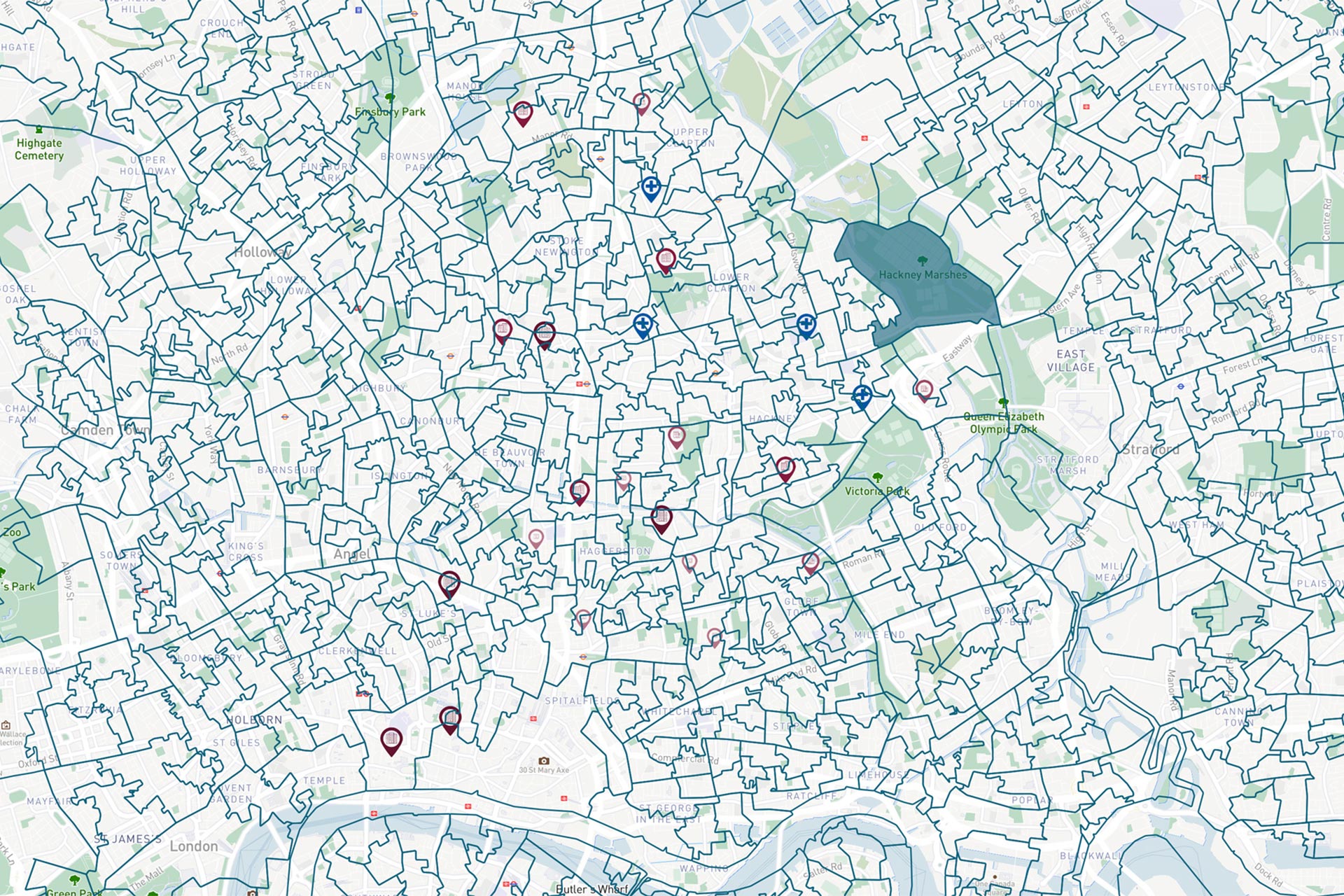
The map
The map was designed in Mapbox, making sure to use soft colour which wouldn’t clash against all the elements which had to overlay it.
A first challenge was to design the boundaries lines using different colours which would be fairly distinguishable when overlapped to each other.
The software allows to switch on and off as many boundaries users want at the same time. Which meant that the colours had to be different, but also not to clash with each other creating a disturbing colour combination. For this reason many tests were done, checking colours and lines thicknesses at different zoom levels.
Below there are some examples of boundaries.

BOROUGHS
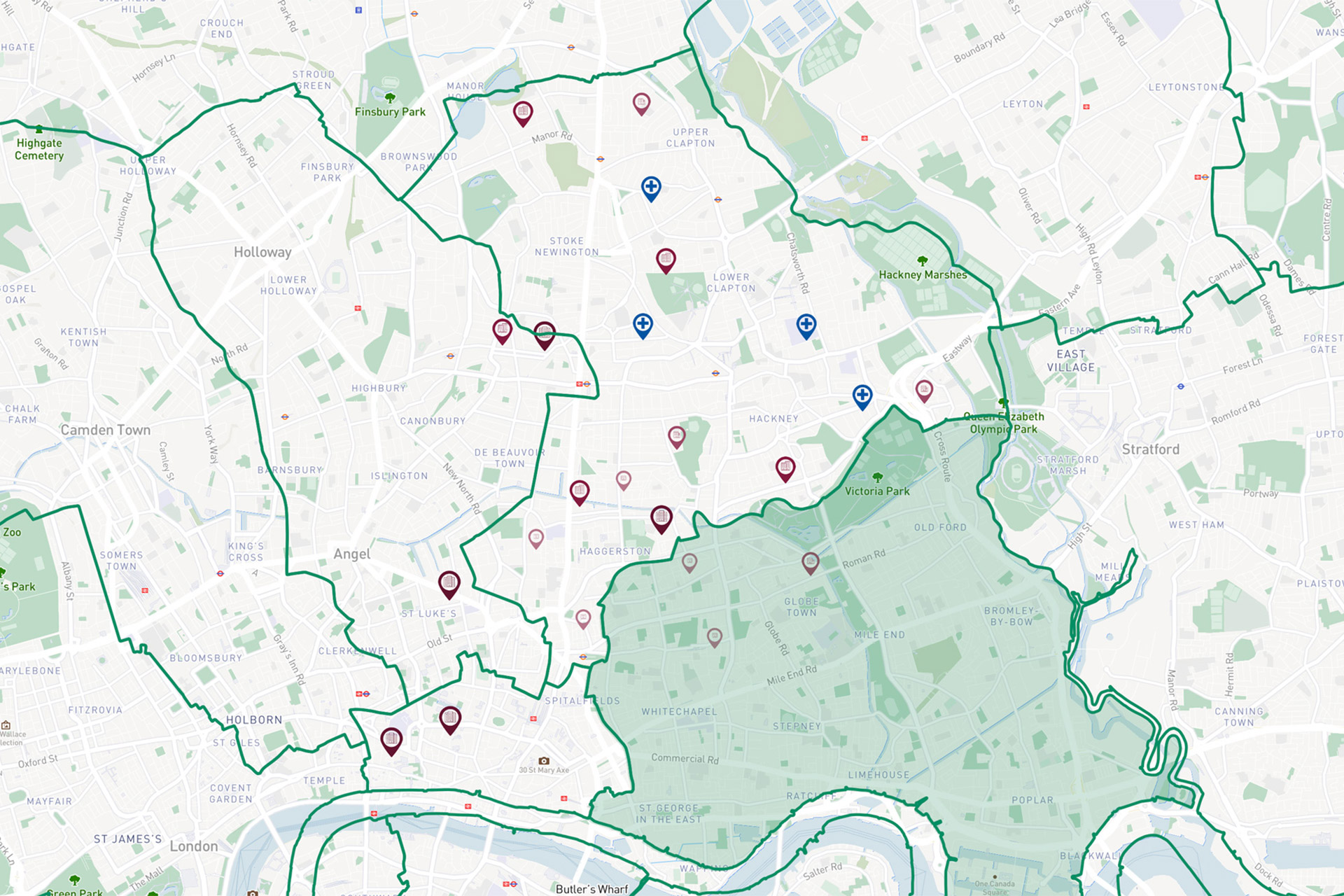
WARDS

MSOA
LSOA
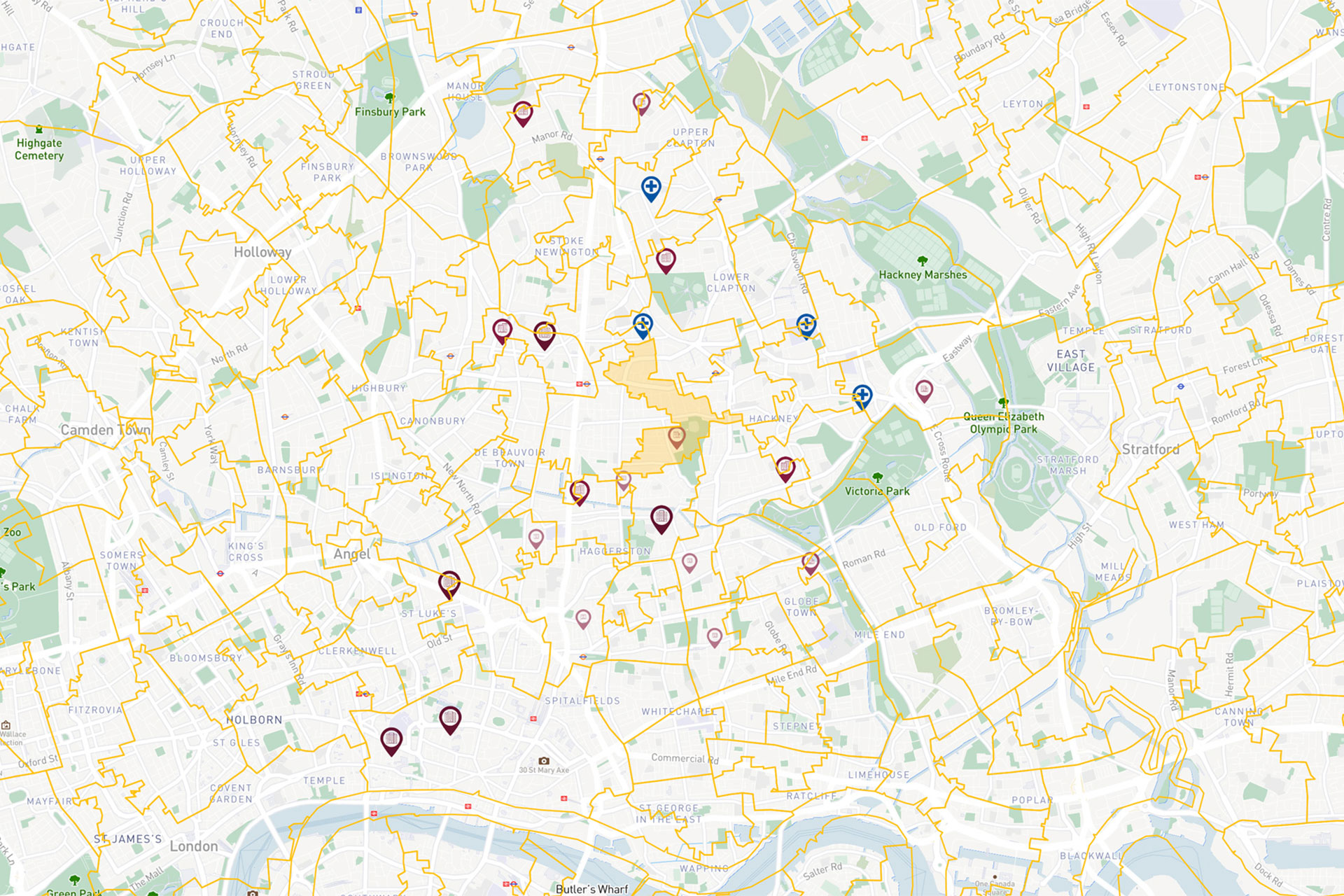
Map icons
Here are some examples of the map icons (or pins) which I designed. The 4 icons with the houses indicate different kinds of housing based on their size. The first four’s in full colour indicate houses already built (in the year selected by the users), while the second row represent the ones in construction.
The last icon instead is for the General Practices. I’ve arrived to design about 40 of these icons so far, the characteristics is that all the ones relative to Health are squared, while the others round.
Health
Housing
Education
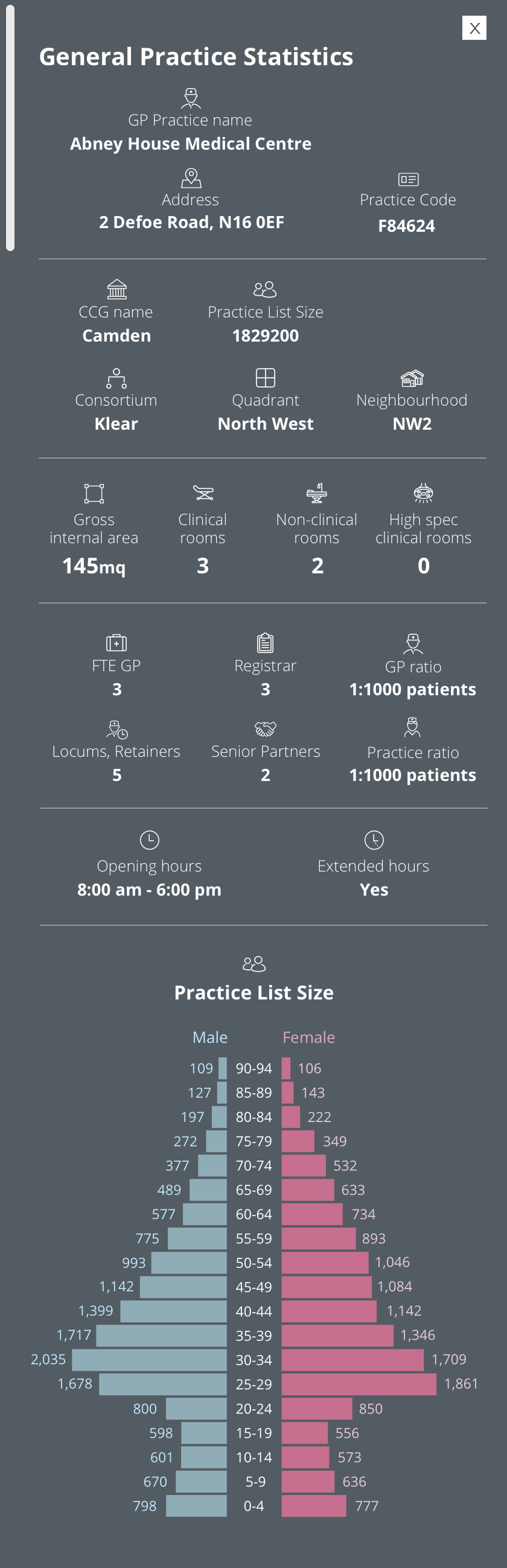
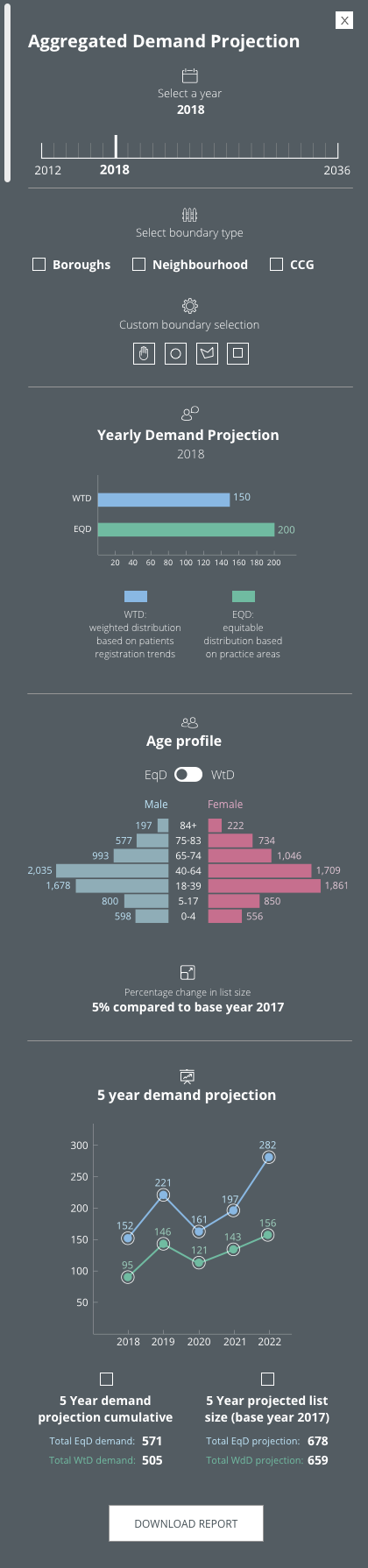
The first sidebars (v1)
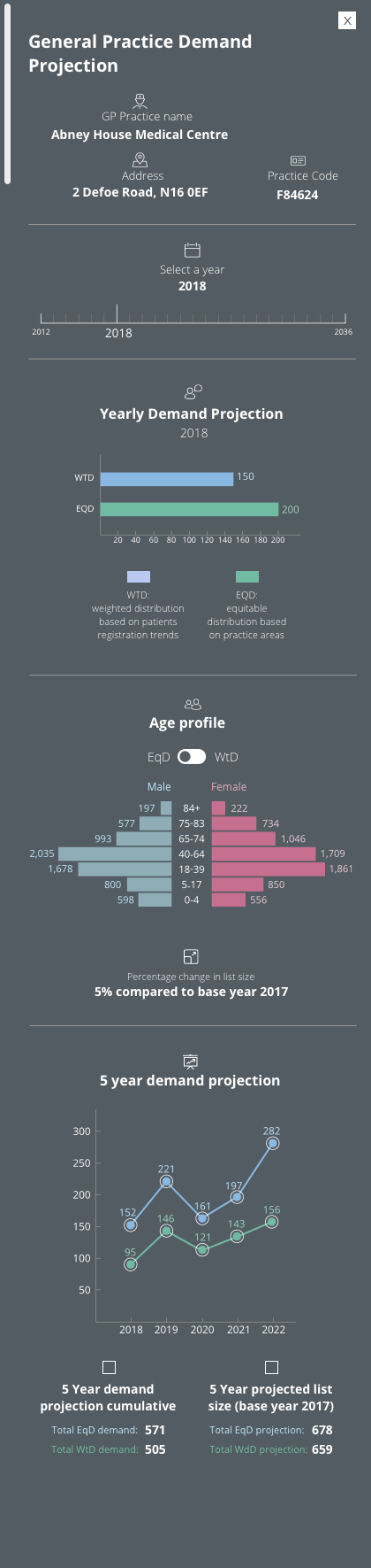
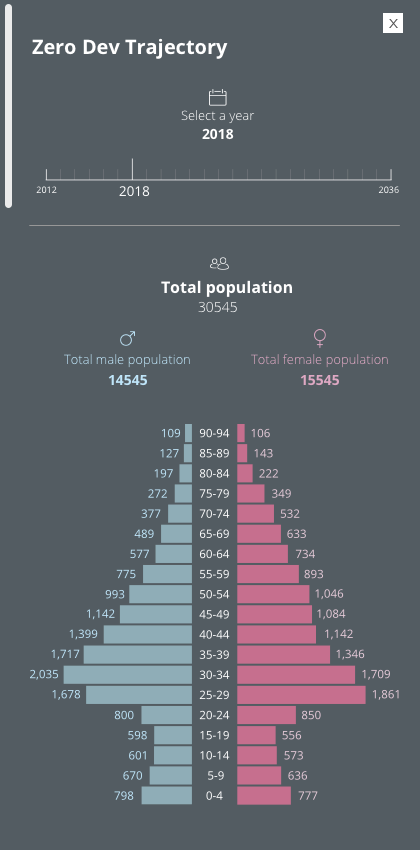
Each sidebar showcases different set of data and some graphs which are often editable by the users. This was one of the most challenging features to design trying to make all data accessible and pleasurable to assimilate. Spacing, font hierarchy, colour code and a large use of icons were fundamental to achieve this. Besides designing them I coded every sidebar, including the graphs.
These here are only a first bunch of sidebars (when the project was at start-up stage). After that we expanded greatly the functions and consequently reviewed the sidebars design several times.

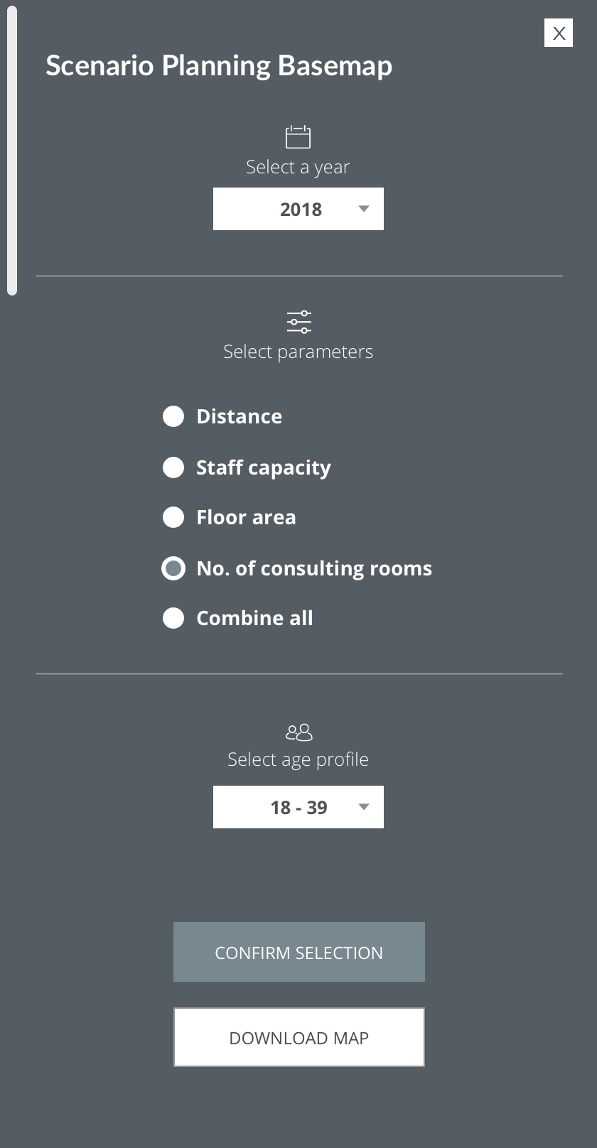
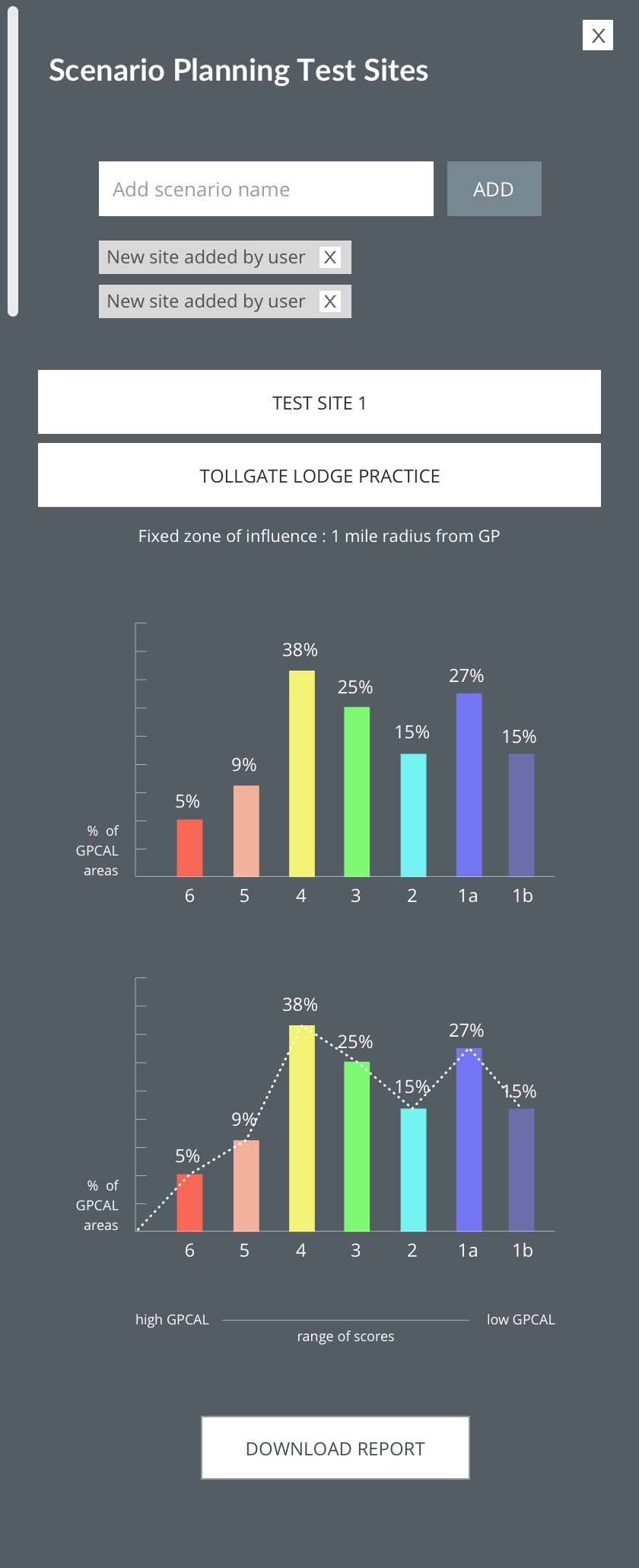
The interface (v1.5)
The ones above were only a first bunch of sidebars (when the project was at start-up stage). After that we expanded greatly the software scope and consequently reviewed the sidebars design several times. Adding among the other things a mid navigation bar and bottom one.
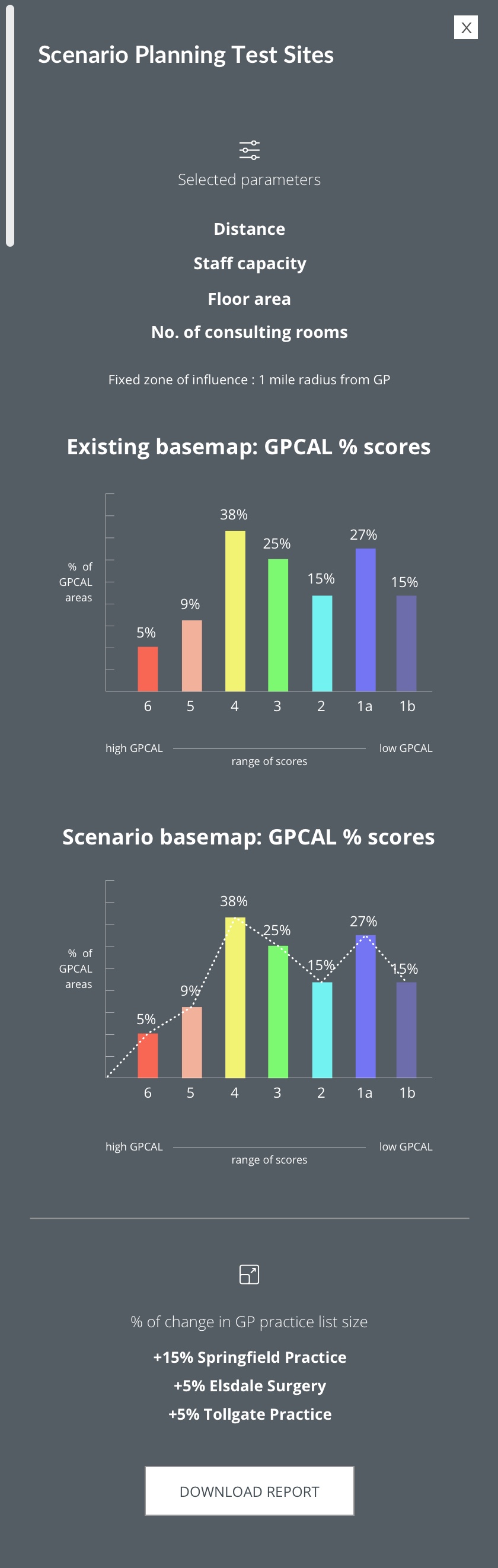
Here below are the examples of some current interfaces. Due to a non-disclosure agreement I cannot share more detailed information and describe the user journey.


The interface (v2)
After two years from the v.15 release we worked on a second version of the software, implementing many more functionalities, a dark and light mode and fixing issues present on the first version.