Lira website

Website redesign for Lira, a company providing accounting, detection and collection of water and heat consumption, operating in Bologna province, Italy.

I realised this website in cooperation with Mauro Micozzi, as part of iDigit Group.

CLIENT: Lira

LIVE WEBSITE: lirabo.com

The website

Website designed in Figma and developed in WordPress.

It lists the services offered by the company Lira and it’s characterised by its sections division by users and services.

The website also presents a user portal, which however is managed by a third party and therefore it wasn’t touched by us. 

The brief

Lira is a company pretty well known in the area they operate (Bologna’s province, Italy) and for this reason they needed little or no advertising.

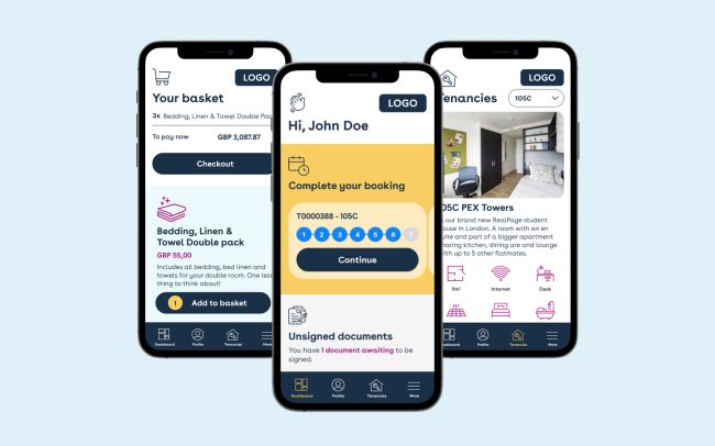
Their main objective for the website redesign was to reduce the pressure on their customer service, providing clear information and instructions online.


THE KEY REQUIREMENTS WERE:

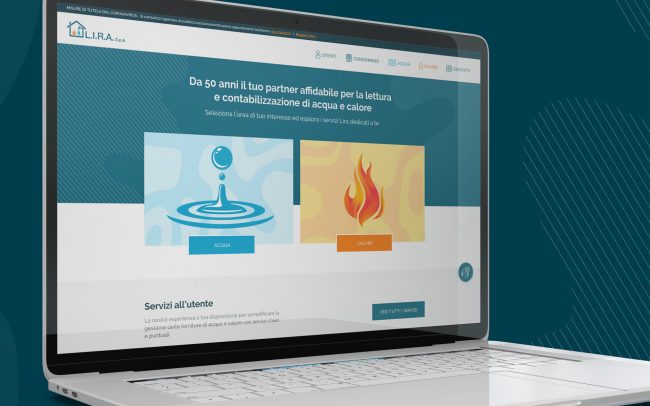
1. Make clear that the company provided both water and heating services. Create a clear distinction between the two services.

2. Speak to both the company’s targets: apartment building administrators and tenants.

3. Give a comprehensive overview of the services provided and how they could be used.

4. Offer an automatic digital support, creating a virtual assistant. We realised a chatbot with Typeform.

5. Modernise the look and feel of the company. We did this through the design and the tone of voice.

Users

As mentioned before, Lira has primarily two targets: apartment building administrators and tenants:

Apartment building administrators are somehow the company’s main clients, since they contract Lira, which is then used by the tenants of the apartments they manage.

Tenants are Lira’s final users. They’re the ones which use most of the company’s services, paying their bills, reporting issues, updating documents, etc.


3 USER PERSONAS:

Anna

Age: 22

Occupation: Student

Status: Single

Interests: Music, sport, volleyball

Need: Use the water service, spend as little as possible and have a quick contact system

Problem: Doesn’t know how to set it up

First contact: The landlord told her to contact Lira

Giovanni

Age: 58

Occupation: Aparment building administrator

Status: Married

Interests: Gastronomy, football, cinema

Need: Having a good product for his tenants which would simplify his job, rather than being an obstacle

Problem: He has difficulties in managing water and heating consumption

First contact: He has known Lira for many years

Paolo

Age: 39

Occupation: Aparment building administrator

Status: Married

Interests: Sport, motorbike, nature

Need: Managing and monitoring his expenditures

Problem: Managing his family balance

First contact: When he bought his apartment

Colour palette

We took the colour palette from Lira’s logo. Which presents a neutral navy blue which we used primarily.

An orange which we used in combination of lighter orange for the heating service dedicated pages and a light blue we used for the water service. In this way we visually solved one of the requirements which was to create a clear distinction between the two services provided by the company.

We paired these colours with two greys and a lighter, pastel blue mostly used for text and backgrounds.

R 0   G 102   B 127   

HEX #00667F

R 0   G 51   B 64   

HEX #003340

R 255   G 120   B 1

HEX #FF7801

R 0   G 166   B 124   

HEX #00A6D6

R 216   G 242   B 250   

HEX #D8F2FA

R 254   G 169   B 1   

HEX #FEA901

R 122   G 122   B 122

HEX #7A7A7A

R 245   G 245   B 245   

HEX #F5F5F5

Typography

The font used is Raleway, a rounded Google Font, which looks professional while giving to the website a young and approachable touch.

Illustrations

Additionally to a colourful palette we decided to use illustrations, which give a modern and sleek feeling. 

With the first draft we tried using some images, but they looked boring and outdated. The website content is quite technical; we always had to end up using classic stock pictures of people at the laptop, on the phone, etc.


SOME OF THE ILLUSTRATIONS WE USED:

Sitemap

We elaborated the sitemap in the very first stage of the project. Through that we organised all the content and created the main separations to which all the subpages are connected:

Water / Heating
Administrators / Tenants

Wireframes

After the sitemap we produced the wireframes for every page. We made them fairly detailed, so that once approved by the client there was not much to look back on the page structure and we could focus exclusively on the design.

Furthermore, we did it to speed up the process. Having defined the content at this stage, we passed it to the copywriter who worked on it while we were working on the designs.

Then once the designs were approved, we already had the actual content. In this way we developed the website populating it with the final content, rather than with placeholders.

Home

The homepage opens up with two big boxes to access the two main services areas: heating and water. With their colours and iconography there is little room for confusion.

Below that we prioritised the services to the tenants, since effectively they’re the people who need to use the website more frequently to pay their bills, update credentials, ask for info, etc..

Following that there is a section with the services for the admins, which as per the section above presents a link to the single services as well as to the administrator general page.

At the bottom of the page there are two sections – a guide section and a help section – which are repeated pretty much throughout the whole website.

Tenants and administrators pages

From the top navigation bar it’s possible to access these two user dedicated pages. One for the tenants and one for the administrator. There are all the services are explained and it’s possible to navigate to the relative subpages.

Tenants & administrators pages

The other two main pages are the ones dedicated to water and heating, which as explained previously, are made clearly distinguishable by their colour scheme. 

These pages present two tabs at the top, which split the content into services for tenants and services for administrators. We opted for this solution in order to make the page easily navigable by both kinds of users, making sure they would only read the content relevant to them. 

Furthermore, using tabs we managed to reduce the number of pages, having just two of them rather than four (Water-Tenants, Water-Admins, Heating-Tenants, Heating-Admins).

About, useful links and contacts

Tenants subpages

Administrators subpages

From the top navigation bar it’s possible to access these two user dedicated pages. One for the tenants and one for the administrator. There are all the services are explained and it’s possible to navigate to the relative subpages.

Similar works:

Privacy Settings
We use cookies to enhance your experience while using our website. If you are using our Services via a browser you can restrict, block or remove cookies through your web browser settings. We also use content and scripts from third parties that may use tracking technologies. You can selectively provide your consent below to allow such third party embeds. For complete information about the cookies we use, data we collect and how we process them, please check our Privacy Policy
Youtube
Consent to display content from Youtube
Vimeo
Consent to display content from Vimeo
Google Maps
Consent to display content from Google