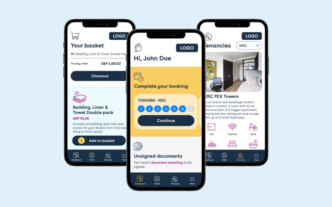
The issues with the existing portal
The existing portal was designed exclusively for desktop, thus its mobile version was showing many limits and usability problems – it was barely responsive. Here I listed some of the issues and how I solved them.
1. The header section & menu position
The problem
The page title and the user credentials (photo, username and email) are taking up a big portion of the screen, leaving the menu in an uncomfortable position in the middle of the screen. Therefore, the content is pushed almost at half of the screen.

The solution
The user credentials are removed altogether, the menu is fixed at the bottom of the screen and the page title is at the top of the screen together with the company branding.

2. Stacked blocks
The problem
The booking blocks (as well as other blocks throughout the app) are stacked under each other, making the page unnecessarily longer and less usable, since the repetition of content might even be confusing for the user.

The solution
The block height is reduced and the stacking is solved by a simple horizontal scroll.

3. Inconsistent illustration sizes and content alignment
The problem
Illustrations are in different sizes, titles are inconsistently aligned to the left and to the right, plus there is left padding between sections with plain text and checkboxes or bullet points.

The solution
I removed the illustrations altogether using icons instead (although I also provided an option with illustrations, shown below) and made sure to keep the same alignments and proportions for all content.

4. Inconsistent buttons
The problem
Multiple styles were used for buttons influencing the usability as well as the aesthetic of the app.

The solution
Used consistent buttons, with consistent colours.

5. Tables
The problem
Multiple styles were used for buttons influencing the usability as well as the aesthetic of the app.

The solution
Used consistent buttons, with consistent colours.

The app
The app is meant to be integrated on third-parties websites and as such is thought to be fairly neutral and easily interchangeable. Reason why I created a colour 6-colours palette and assigned each of them to a variant on a separate CSS file and left a space for the client logo on the top right of the screen (on mobile).

4 main sections
The bottom bar menu contains the 3 main sections and the menu where all sections are listed. This is meant to be modular and changeable. In fact the clients can decide which are the two sections to keep in the middle.


The dashboard


Payment pages


Bulletin board
Simply a customised blog section.


Documents, basket, maintenance & inventory


Alternative option designs – the dashboard
I designed two options for the client to pick from and this one was the discarded one.


Details & Tenancy


Payment pages


Bulletin board, basket & 404


Documents & Maitenance


Inventory pages


Similar works: