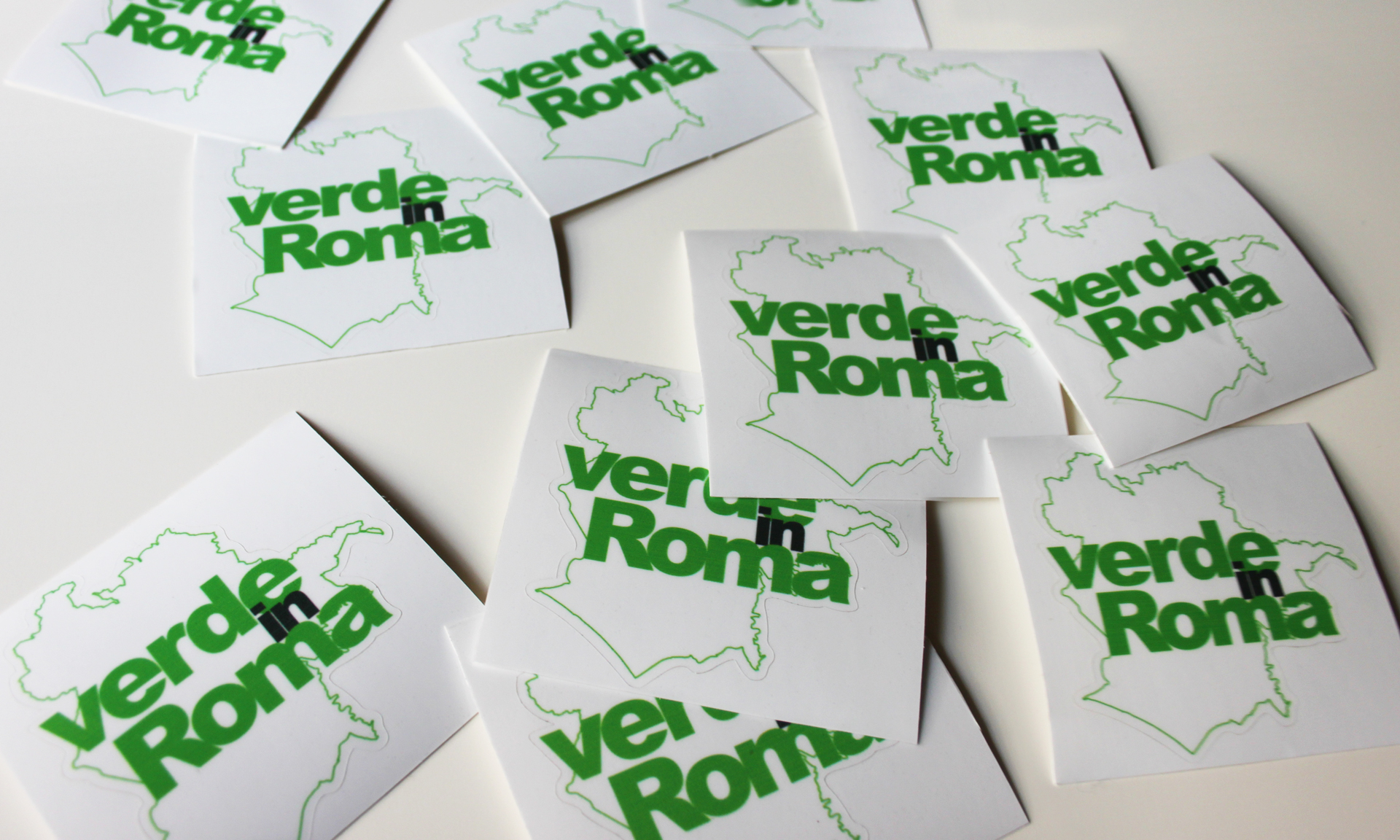
Logo
The bold clustered text in Arial Black lays over the city of Rome outline, for an essential logo easy to replicate for other cities.
Logo colour variations
Colour Palette
Besides a large use of black and white, the choice of a set of green colours was “slightly” obvious.
CMYK:
C: 60 M: 0 Y: 100 K: 0
RBG:
R: 118 G: 184 B: 4
CMYK:
C: 50 M: 30 Y: 50 K: 30
RBG:
R: 115 G: 126 B: 108
CMYK:
C: 65 M: 60 Y: 55 K: 35
RBG:
R: 87 G: 80 B: 81
CMYK:
C: 12 M: 0 Y: 20 K: 0
RBG:
R: 232 G: 241 B: 218
CMYK:
C: 0 M: 0 Y: 0 K: 10
RBG:
R: 237 G: 237 B: 237
Typeface
The whole Arial family has been used for the project, usually characterised by a reduced tracking, especially in the bold Arial Black titles, inspired by the style of the year which saw campaigns such as the Diesel one “Be stupid”.
Garamond Italic is instead used mainly for quotes.

FONT: Arial Black
TRACKING: -100
STYLE: Uppercase
USE: Main headline

FONT: Arial Bold
TRACKING: -80
STYLE: Uppercase
USE: Secondary headline

FONT: Arial Black
TRACKING: -60
STYLE: Lowercase
USE: Secondary headline

FONT: Arial Regular
TRACKING: 0
STYLE: Lowercase
USE: Standard copy

FONT: Arial Italic
TRACKING: 0
STYLE: Lowercase
USE: Special copy

FONT: Arial Narrow
TRACKING: 0
STYLE: Lowercase
USE: Notes, secondary copy

FONT: Arial Regular
TRACKING: 75
STYLE: Uppercase
USE: Image caption

FONT: Garamond Italic
TRACKING: 0
STYLE: Lowercase
USE: Quotes
Pictures
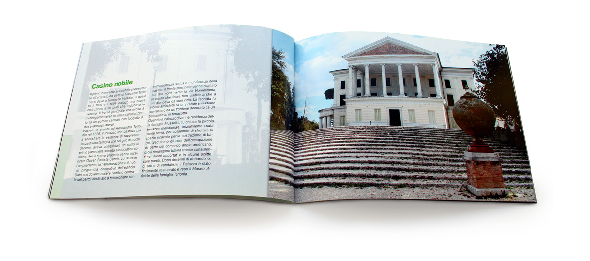
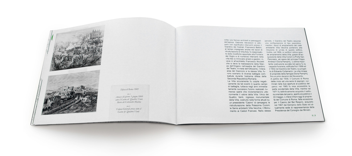
All park’s pictures have been taken by me with a poor Canon EOS 500D.


Dossier
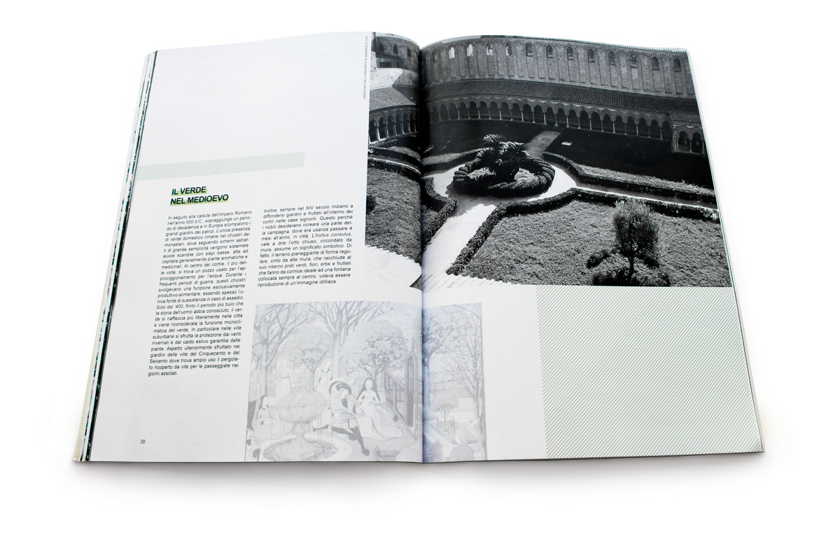
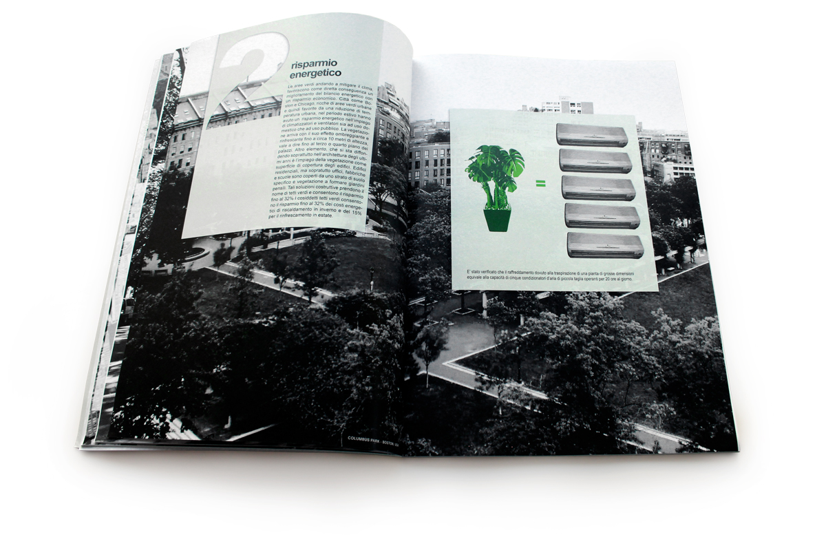
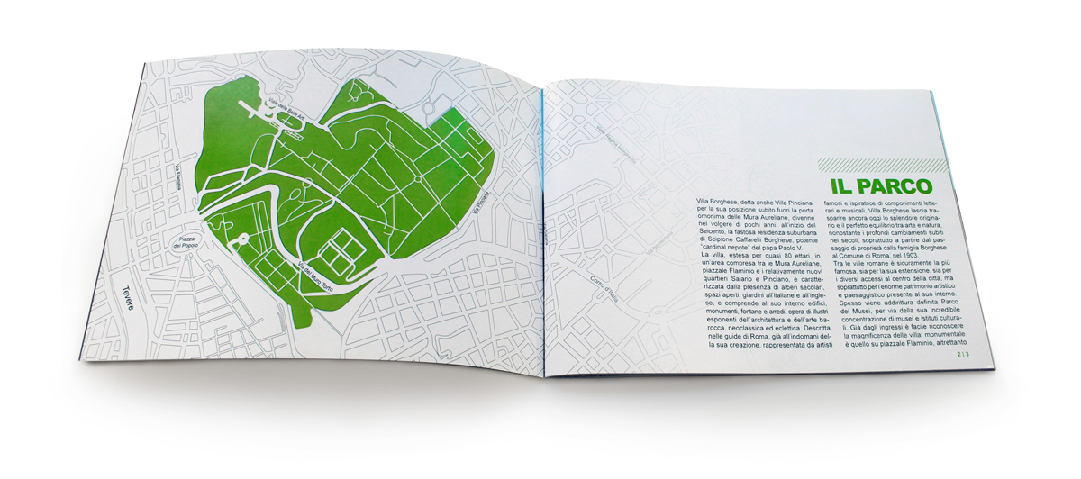
This is an introduction to the project. It gives an overview of the state of the green in the city, underlining its importance, its history and how it appears more specifically in the city of Rome.
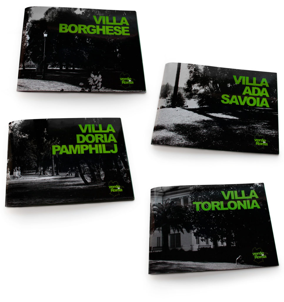
Booklets
32-pages booklets in A5 landscape format focused on the four main parks of Rome:Villa Borghese, Villa Ada Savoia, Villa Doria Pamphilj and Villa Torlonia.
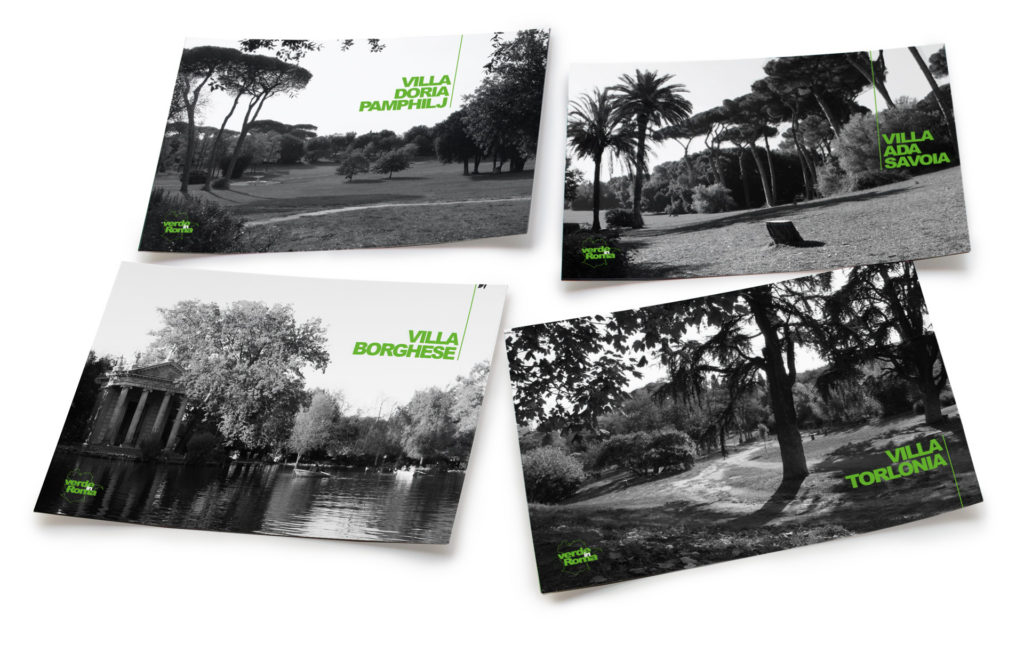
Postcards
Postcards in classic format (15×10.5cm), where the green logo and the park’s name stands out the strongly contrasted black and white background.
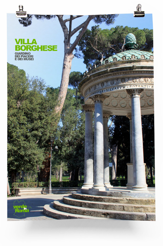
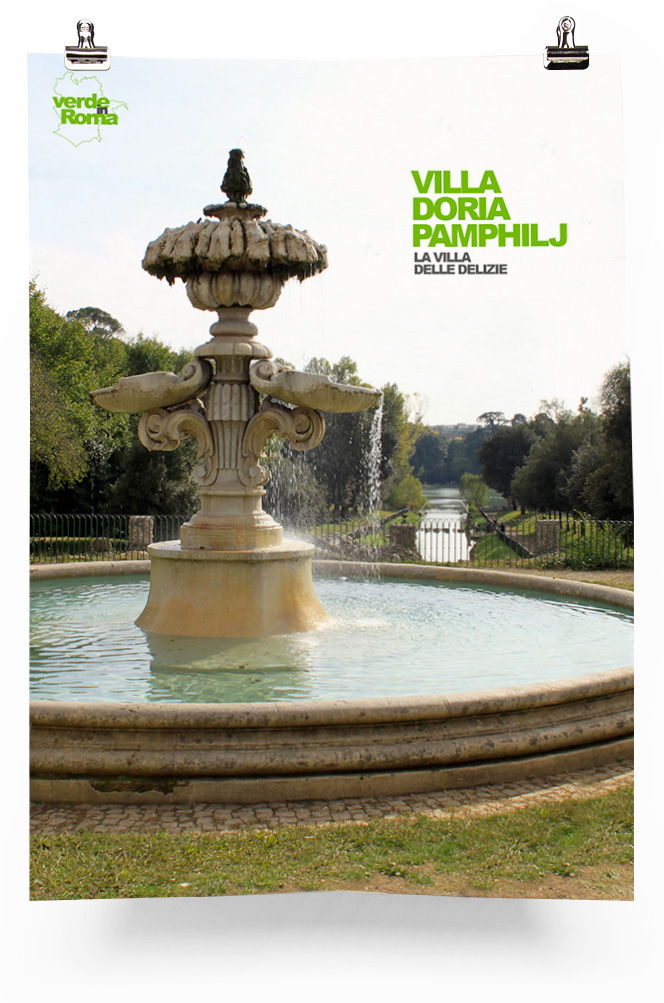
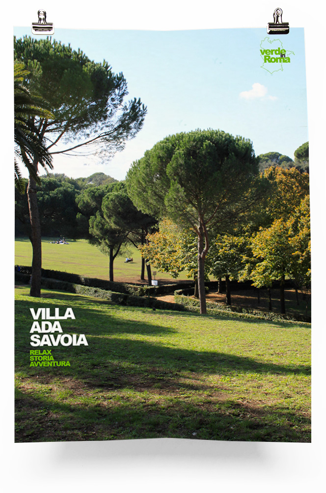
Posters
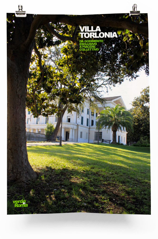
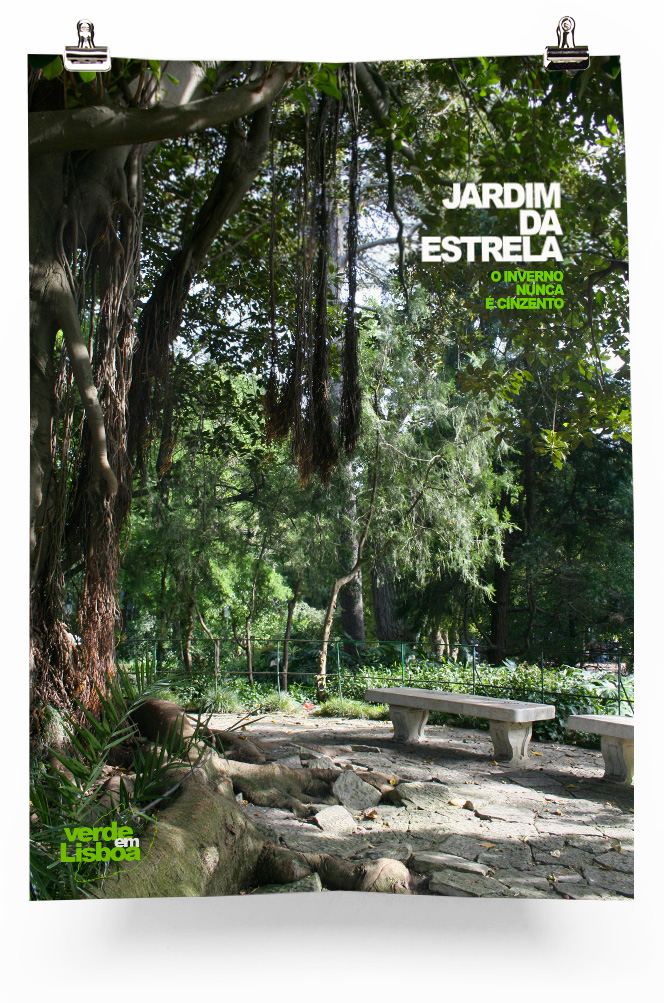
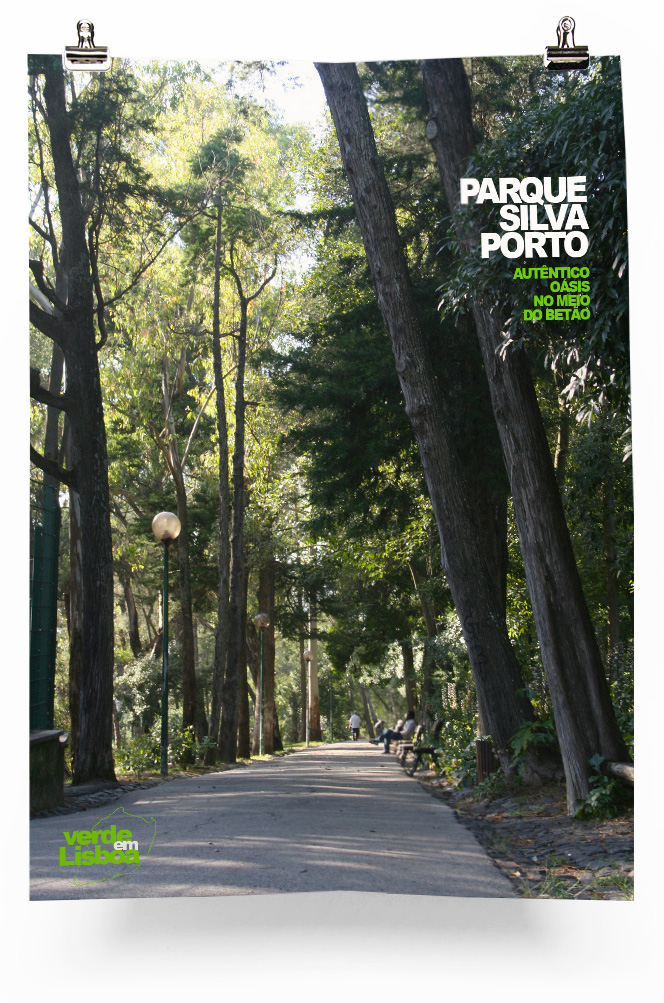
A2 posters presenting a picture of a characteristic spot of the park, its name and a slogan.
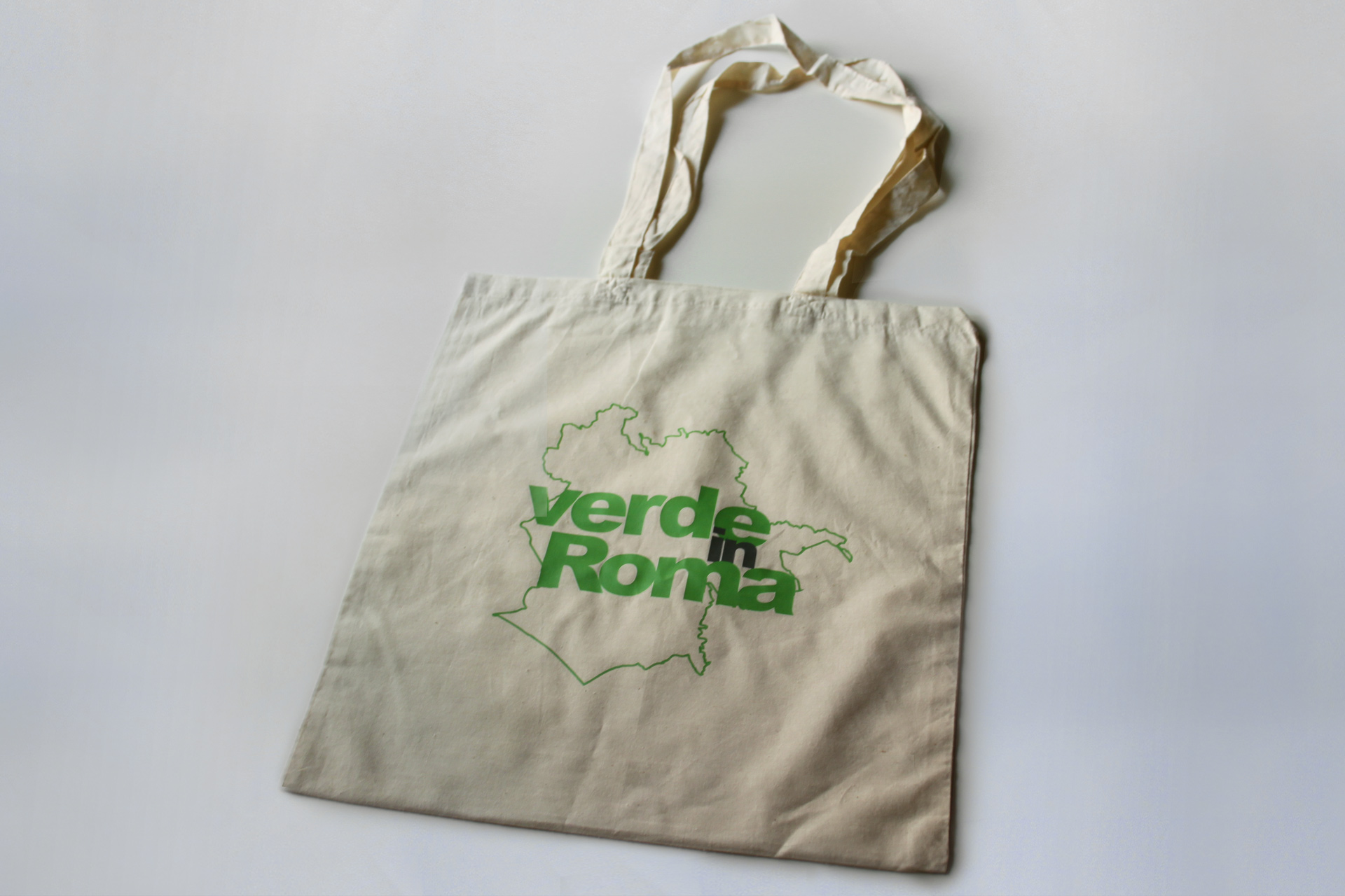
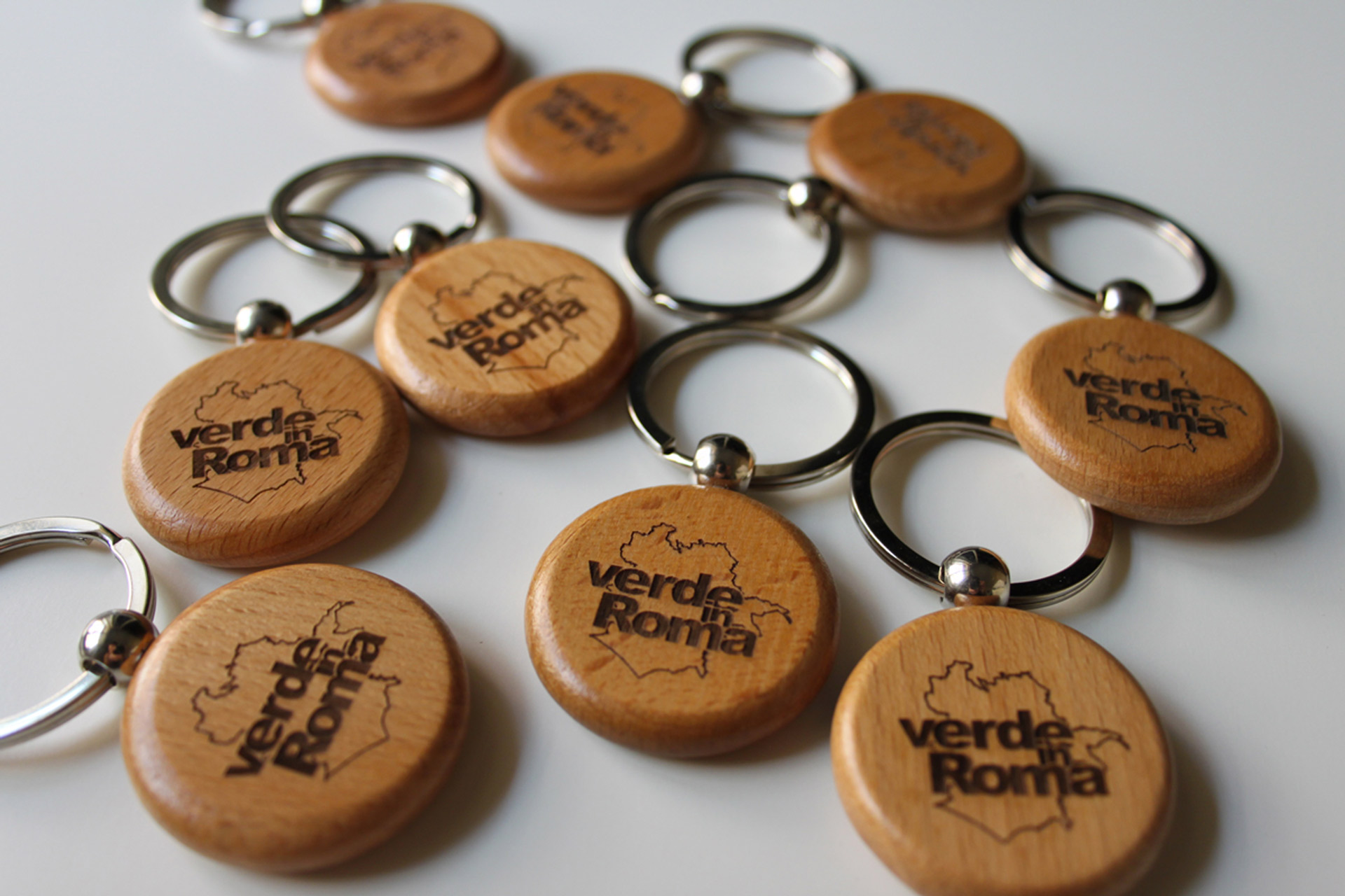
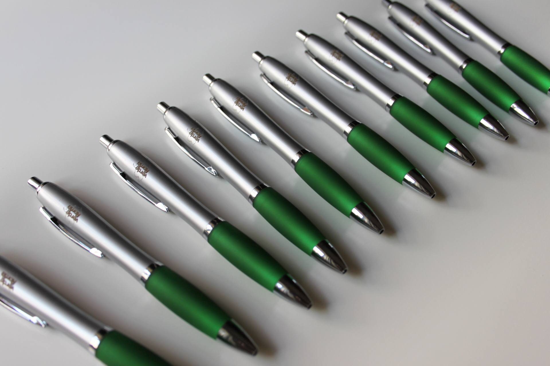
Gadgets
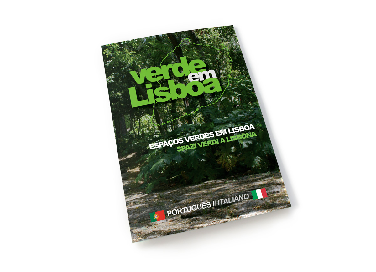
Verde em Lisboa
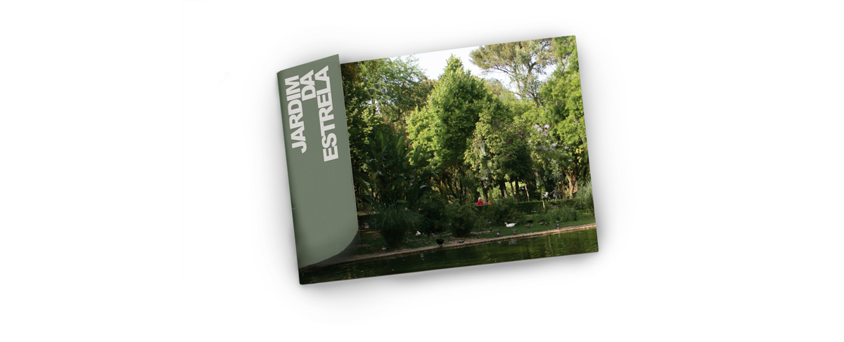
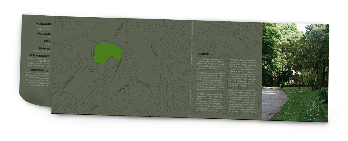
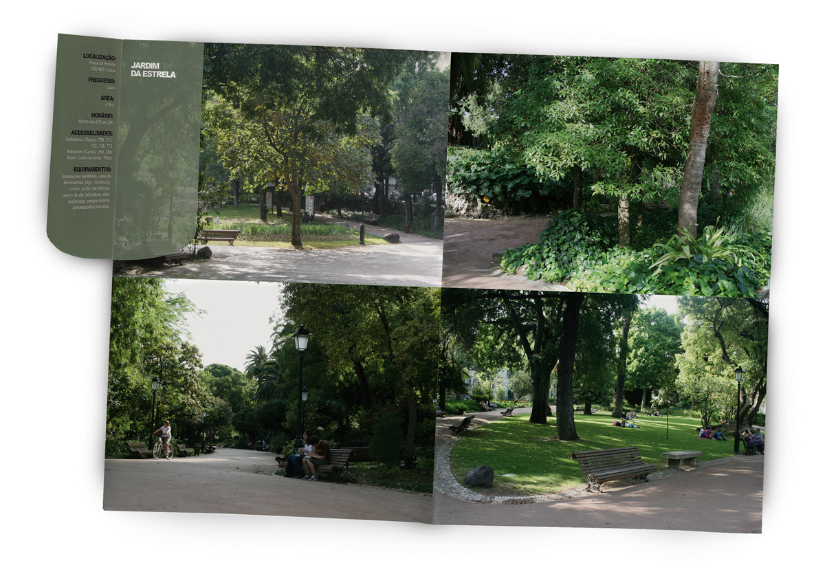
Parallel project realised a year before Verde in Roma. For the occasion a similar set of materials have been created.
Leaflets
18 leaflet, one for each park of Lisbon, got from an A3 sheet. Measuring 18.7×13.3cm when completely folded.
Guidebook
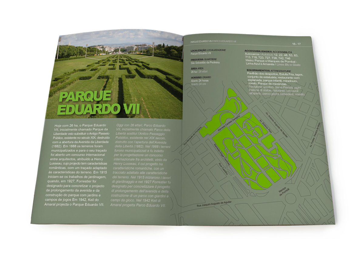
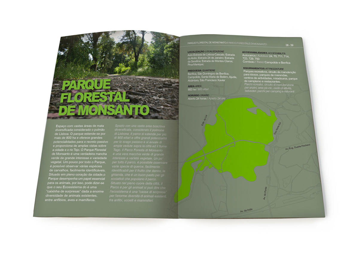
All information about Lisbon’s parks are gather in a bilingual pocket-sized guidebook.
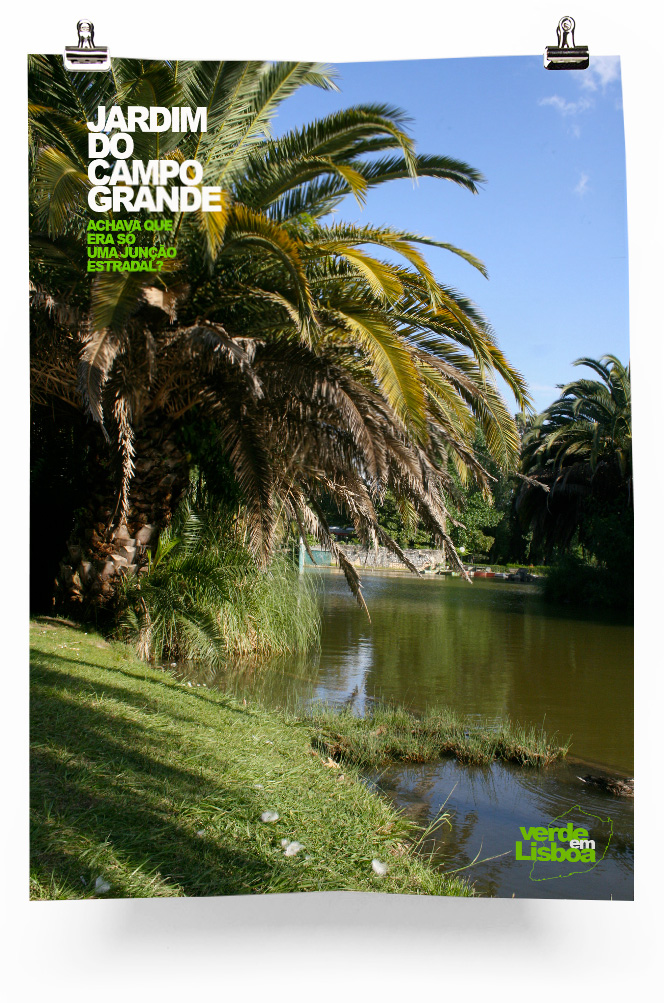
Posters
A2 posters like the ones realised for Rome.
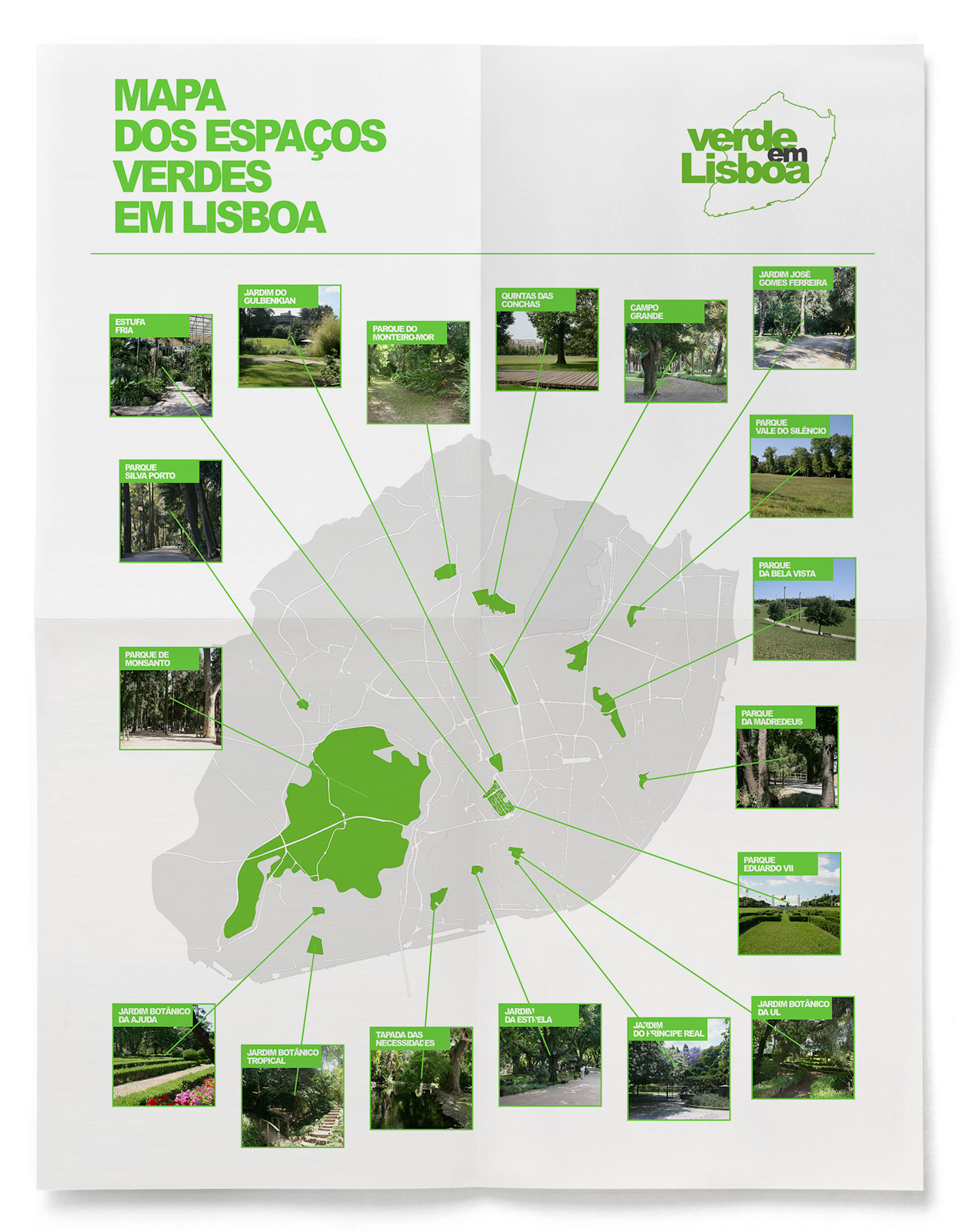
Parks map
The 18 main parks of Lisbon are indicated on this large A0 map.
Potential expansions
Logos for other cities where the project could be developed.