How much does a logo cost?
That’s one of the most annoying questions for a designer. The issue is that the answer is not easy without having more details. It’s like asking how much does it cost to make a roof for a house? It depends on the kind of roof, the size of the house, where the house is and so on. (I tend to make comparisons with constructions, as it’s more tangible).
One essential factor is how clear the client’s idea of the logo it is. If they already have something in mind or some preferences. i.e. they already know there has to be the symbol of a horse in the logo, the text has to be blocky and bold, etc. The more details given the quicker (and therefore cheaper) the work is. However, in this case the client had no much ideas on what to do.
The logo had to be: clean, simple, quality, transparent, easy, reliable, trust and game changing. The style minimal, flat, modern. While regarding the font: no preference as long as it was modern. That unfortunately doesn’t mean much.
The brief was pretty vague, there were no references to anything. If not that the logo had to be somehow related it’s function: a portal providing a workplace concierge service.
So after a market research – looking at potential competitors and businesses providing similar services – I sketched out some different logos to try to follow the indications given in the brief. I tried different kinds of fonts, as well as styles.
It’s actually quite common that the brief is very open. Many times clients want to create a brand, but have no idea what could be a good logo for it. It happens that they never really thought about the logo itself until the work is in progress. In these cases I tried to open up different routes, proposing different fonts, styles and type of logo. In this way, I try to see which route or at least direction the client wants to follow.
01
02
03
04
05
06
First review
Of the first set none of the logo was good. Yet, I wasn’t expecting to guess what the client had in mind at the first attempt, but what I did there was breaking the ice. Push the client to think what they actually want, to affine a bit their ideas and try to find a direction.
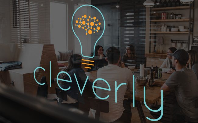
The second brief was indeed much more specific. They wanted a brain (for clever) in the logo, as well as a lightbulb which stood for idea, like an innovative idea-tool. Specifically they wanted to include a brain inside a lightbulb.
The font had to be more delicate and in lowercase, as they liked the first option, although that looked a bit too playful. That was so much better than “modern”. Furthermore they wanted to see some colours. I usually say that the colour should be the last element, as any logo should work in black and white as well, but I understand that having some colours helps to better view the logo even from the first stages.
01
02
03
04
05
06
07
08
09
Second review
From the second bunch, the client liked the third option. However they wanted a more abstract brain. Plus they decided to drop the “.works” bit from the logo.
Third review
The client was happy with the previous option, but asked to check some other colour combinations and try some similar font.
01
02
03
04
05
06
The final logo
Colour Palette
After designing the logo I was asked to create the rest of the brand image – once I was finally clearly explained what the logo was for. To compensate the light colour I suggested a dark blue to be one of the primary colour. Such colour indeed is used for backgrounds as well as current text throughout the materials.
Primary colours:

C 51 M 0 Y 21 K 0
R 117 G 204 B 207
HEX #75CCCF

C 0 M 46 Y 97 K 0
R 249 G 156 B 35
HEX #F99C23

C 100 M 75 Y 44 K 37
R 0 G 55 B 83
HEX #003753
Secondary colours:

C 17 M 6 Y 93 K 0
R 219 G 213 B 54
HEX #DBD536

C 53 M 0 Y 44 K 0
R 119 G 200 B 167
HEX #77C8A7

C 5 M 94 Y 34 K 0
R 227 G 51 B 111
HEX #E3336F
Brand font
Lato Light
The quick brown fox jumps over the lazy dog
Lato Regular
The quick brown fox jumps over the lazy dog
Lato Bold
The quick brown fox jumps over the lazy dog
The portal
The actual product for which the branding was intended is the web portal.
I dedicated an entire case study to it which you can find here.

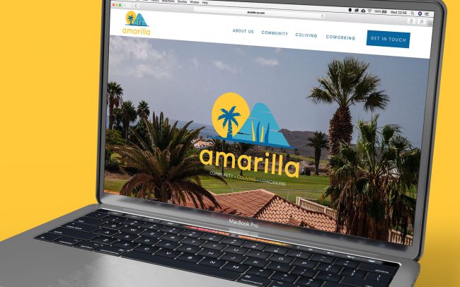
The website
A very simple presentation website from where users can access the portal.
It is live here, but unfortunately the client decided to have it developed internally to contain their budget and the result is sadly far from my design.