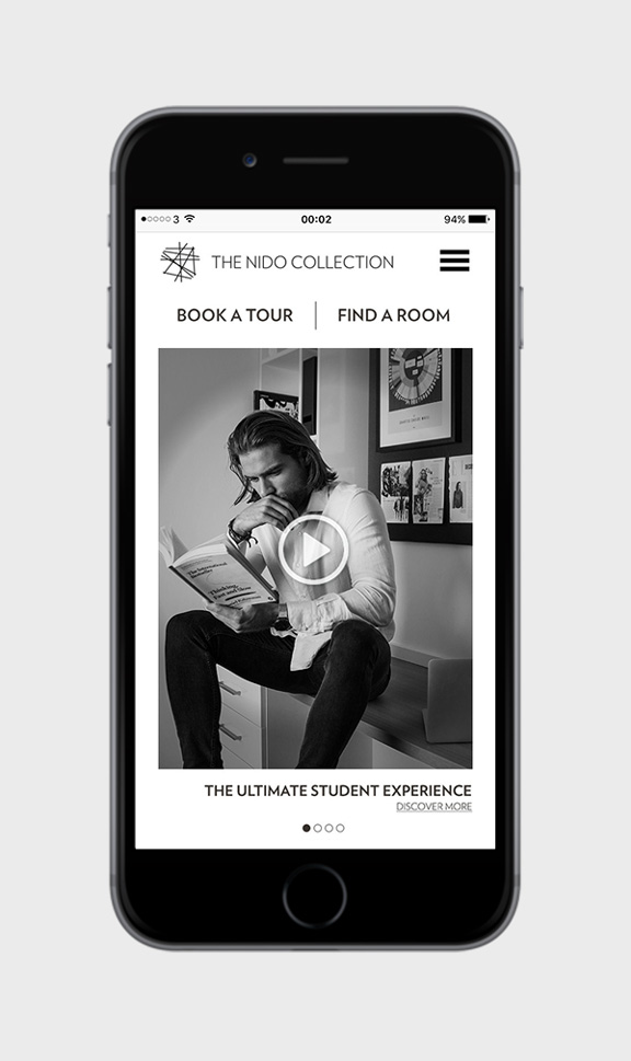
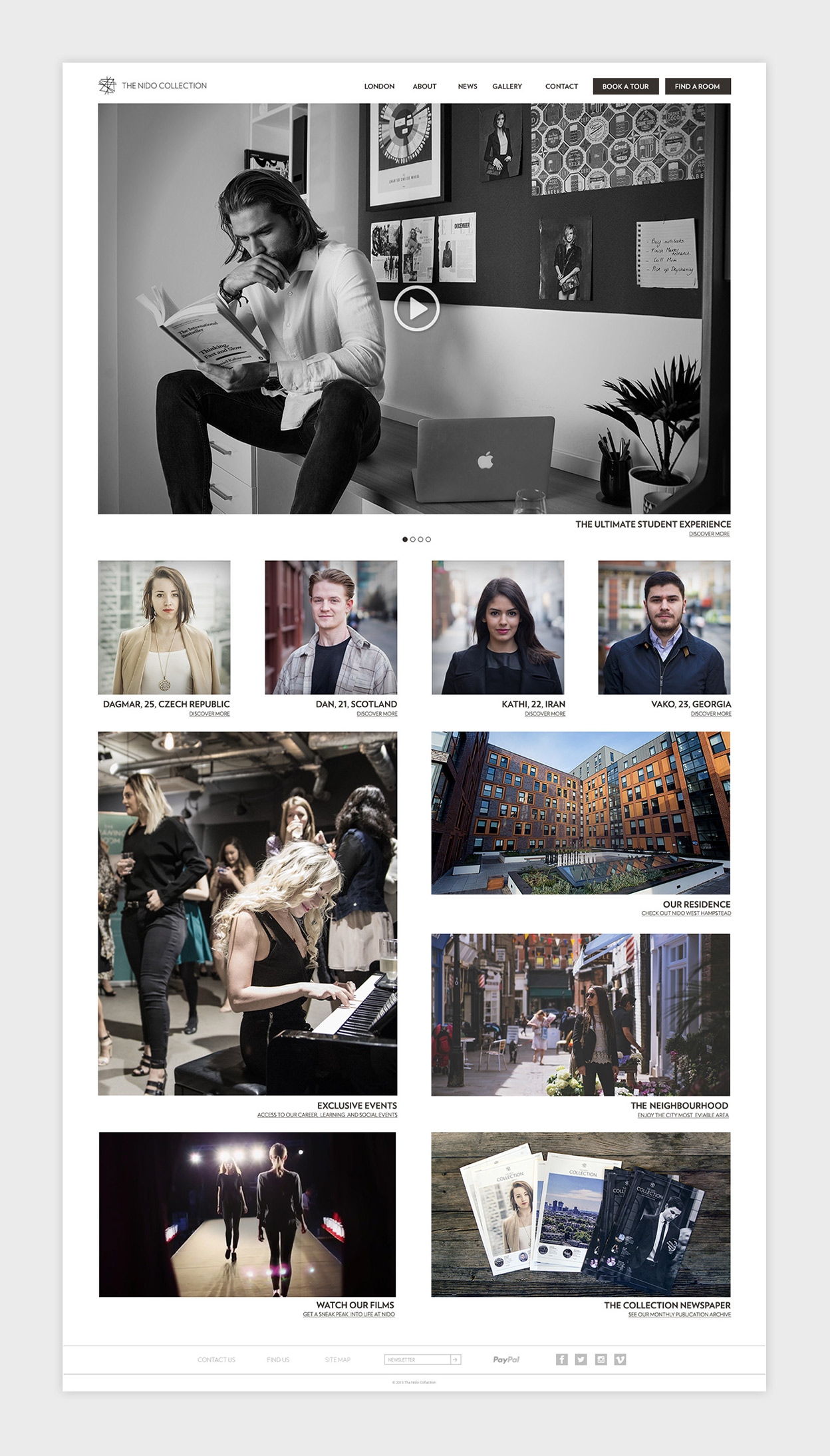
The homepage
The flexible structure characterising the website allows the addition of sections in case of brand expansion. Heavily image focused, the style is simple and minimalistic, with white borders around pictures and copy reduced to the minimum, in order to assure an easy and pleasurable user journey.
The Location
Intuitively this is the first section to be accessed, since users will be likely to look for a city in particular and want to see where the brand operates.
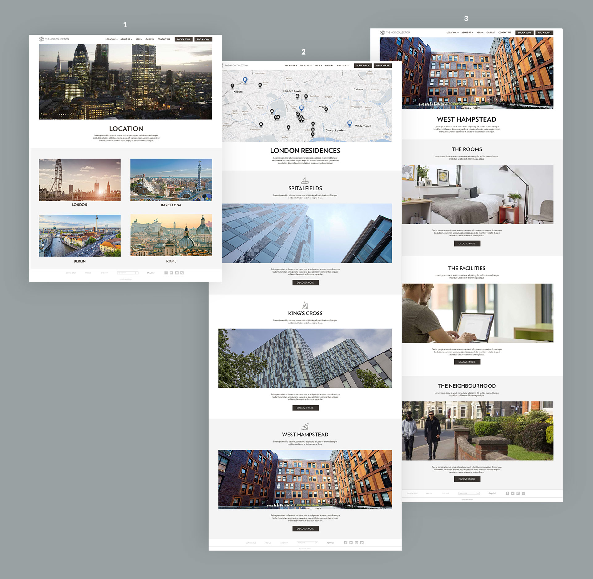
1 The cities
The cities where The Nido Collection (hypothetically) operates are displayed in a responsive grid.
2 The residences
Topped by a map of the selected city – which is populated by markers on residences and universities – this page lists each residence with a picture and a short introductory copy.
3 The single residence
The residence page is populated by the subpages of each property such as rooms, facilities, neighbourhood, etc. The flexible structure allows the addition of unlimited subpages.
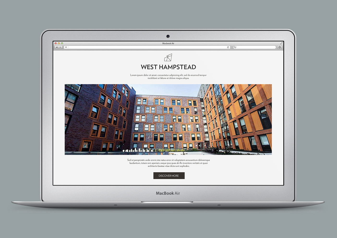
Each section is made up by:
- header
- image
- short description
- an eventual call to action and a button leading to the section
This template, applied throughout the whole website makes sure all the section content is visible in a single screen even on the smallest screens.
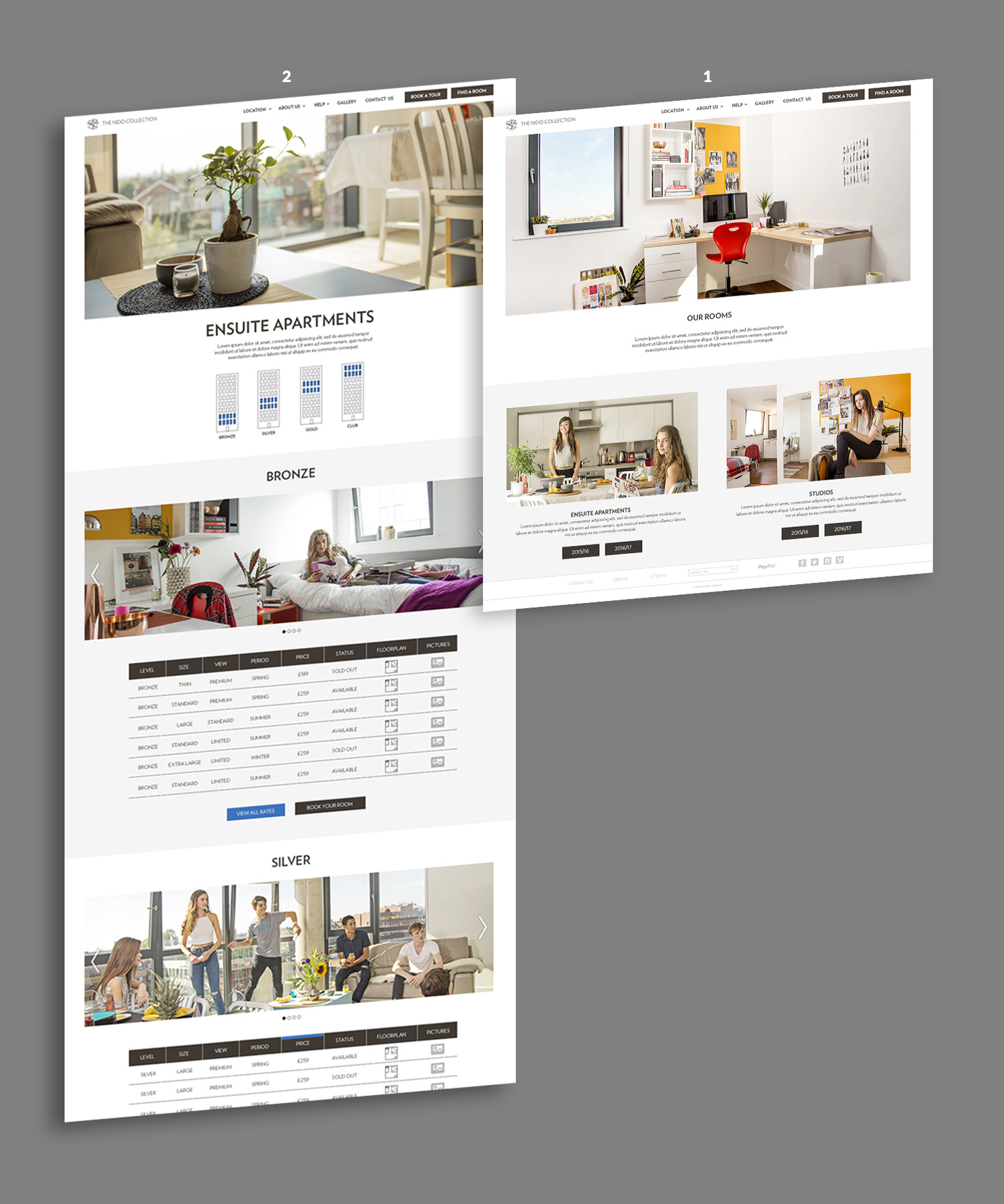
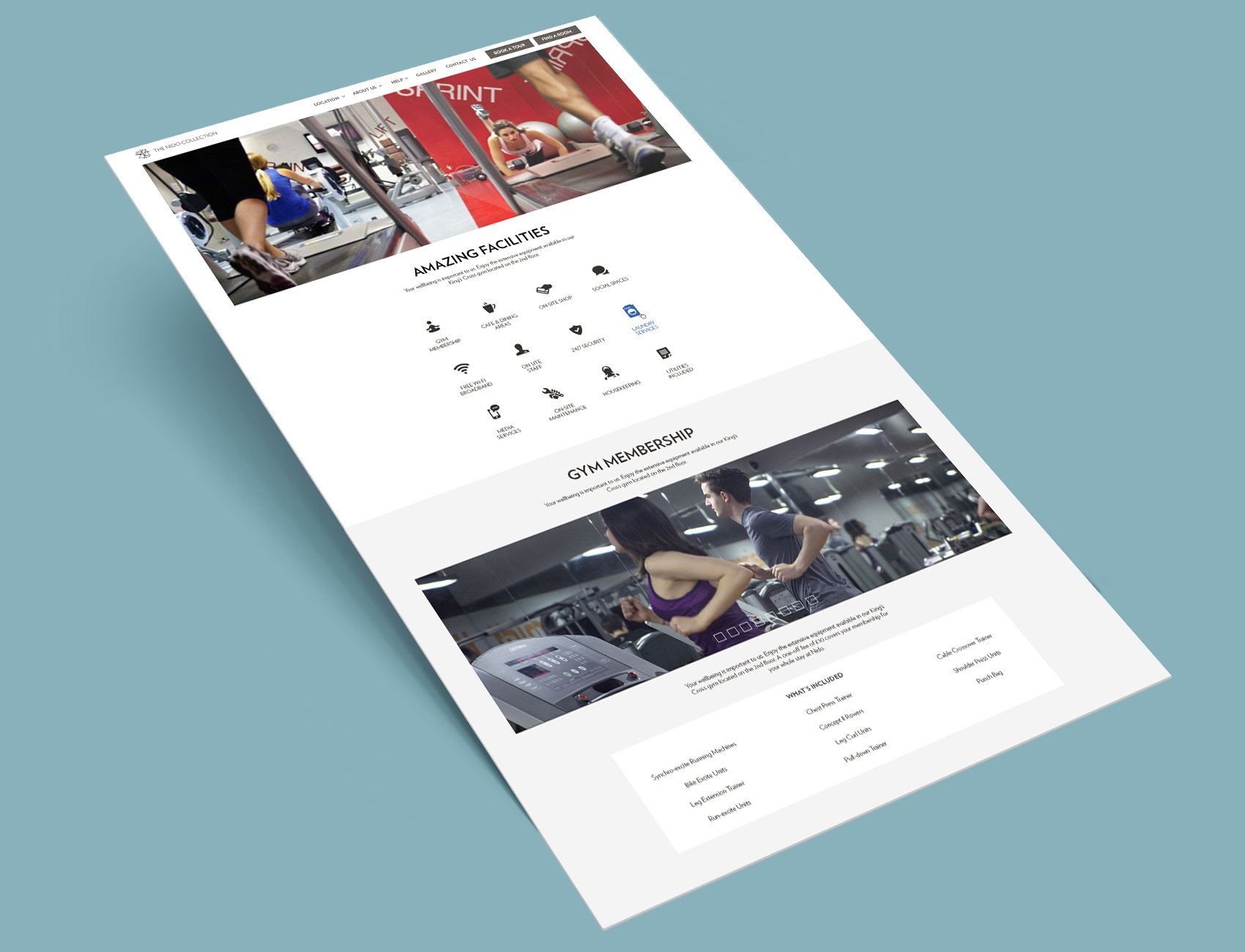
The Rooms
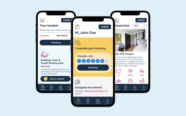
Rooms are the product. This is one of the most important sections of the website and with it came one of the biggest challenges: to explain clearly the difference between rooms, which prices depend on their features: type, size, level, view and contract length.
1 Choose room type…
Room type is surely the most determining feature which therefore we decide to put on a separate page, together with the staying period.
…then pick the room 2
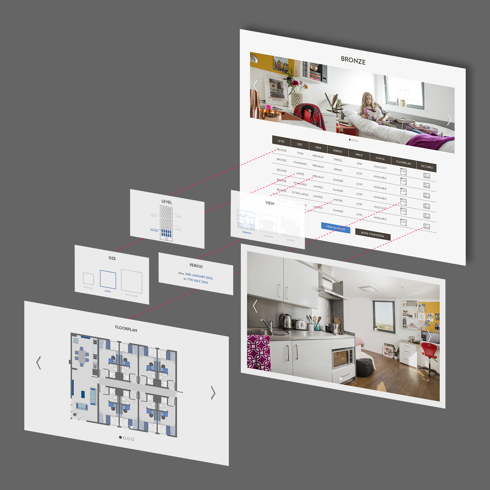
In the next page, are listed in tables all the rooms details. In order to improve the usability, the tables are split according to their levels: bronze, silver, gold, club.
Room details table
Here are displayed all the information about the rooms. Clicking on each slot a small box pops up where the each feature feature is explained through icons and short texts. Floorplan and pictures boxes contains image carousels instead.
Facilities
All the residence facilities are displayed at the top of the page in a clickable grid with icons. This solution not only shows the list in a easy and pleasant way, but serves also as a menu to navigate the page, in place of an annoying dropdown menu (feature which has been avoided throughout the whole website).
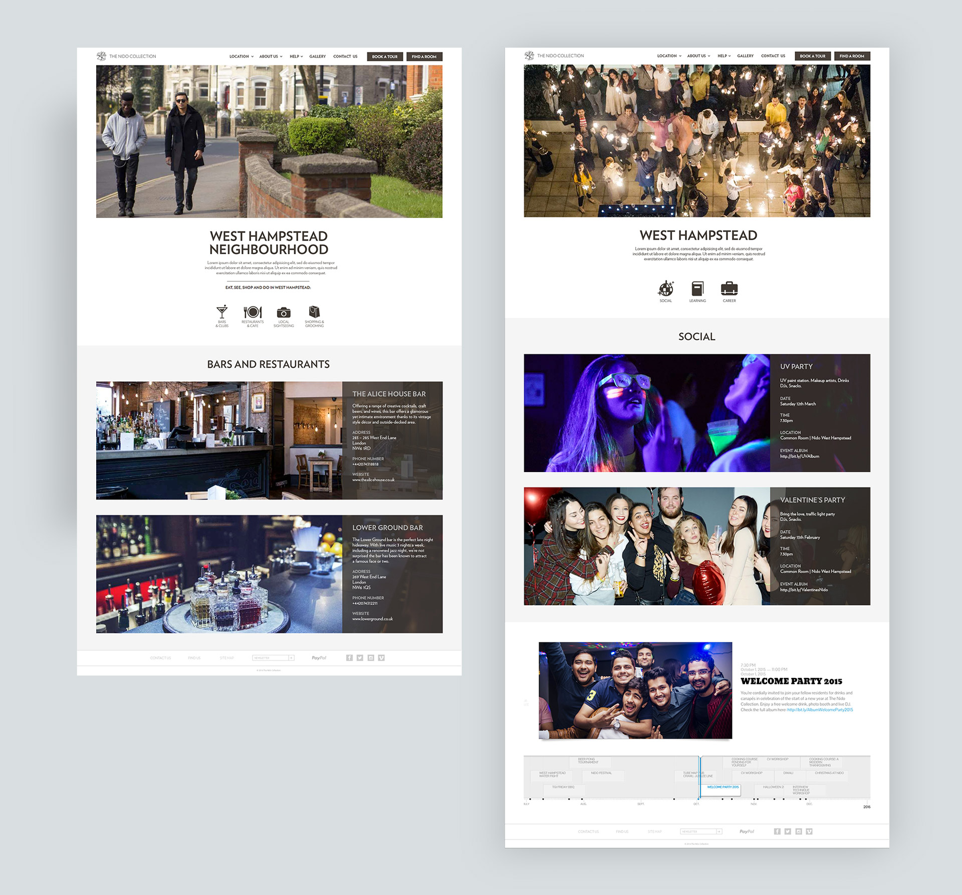
Neighbourhoods & Events
These two pages are made up of an icon menu at the top, on the style of the Facilities page, and images of the place/event with a description in a textbox on the right.
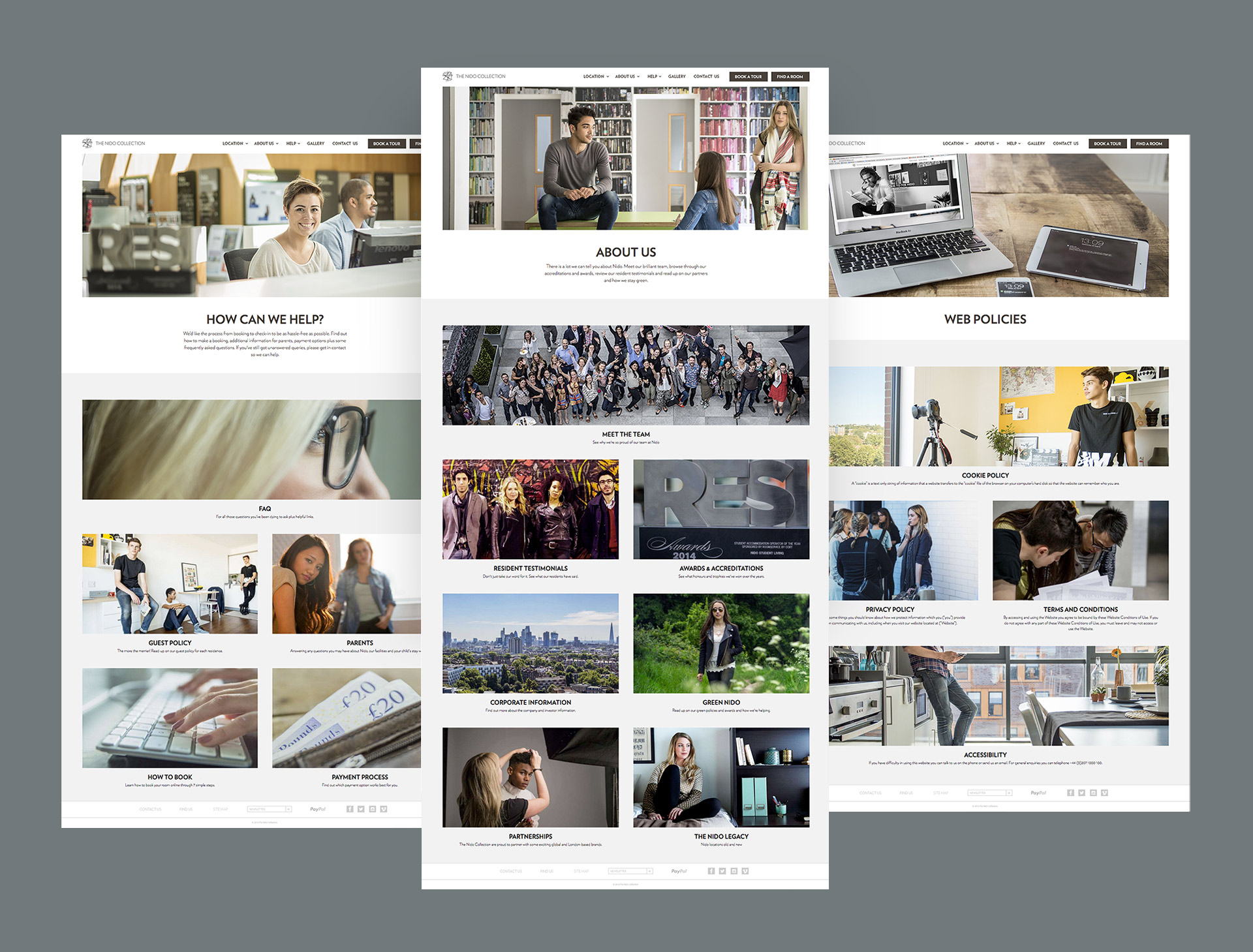
Help, About Us & Web Policies
These pages are made up of a responsive grid populated by their respective subpages, showing their header image, title and intro line.
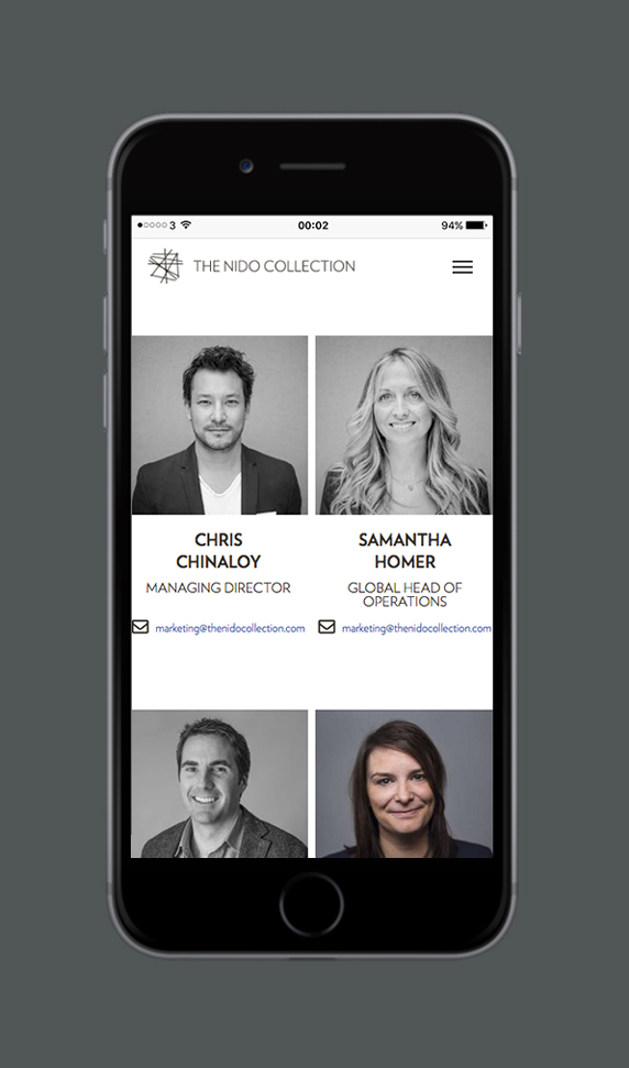
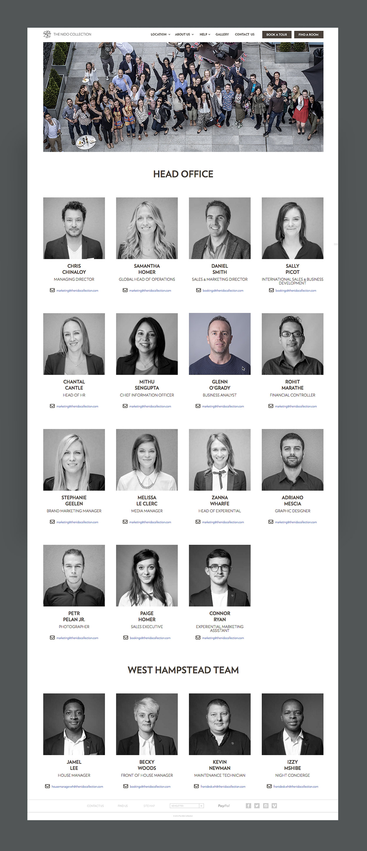
Team
The team page is made up of four black and white pictures per row (two on mobile and six on large screens) which get colours when hovered on desktop or tapped on mobile. Information for each team member are only: job title, email address and phone number.
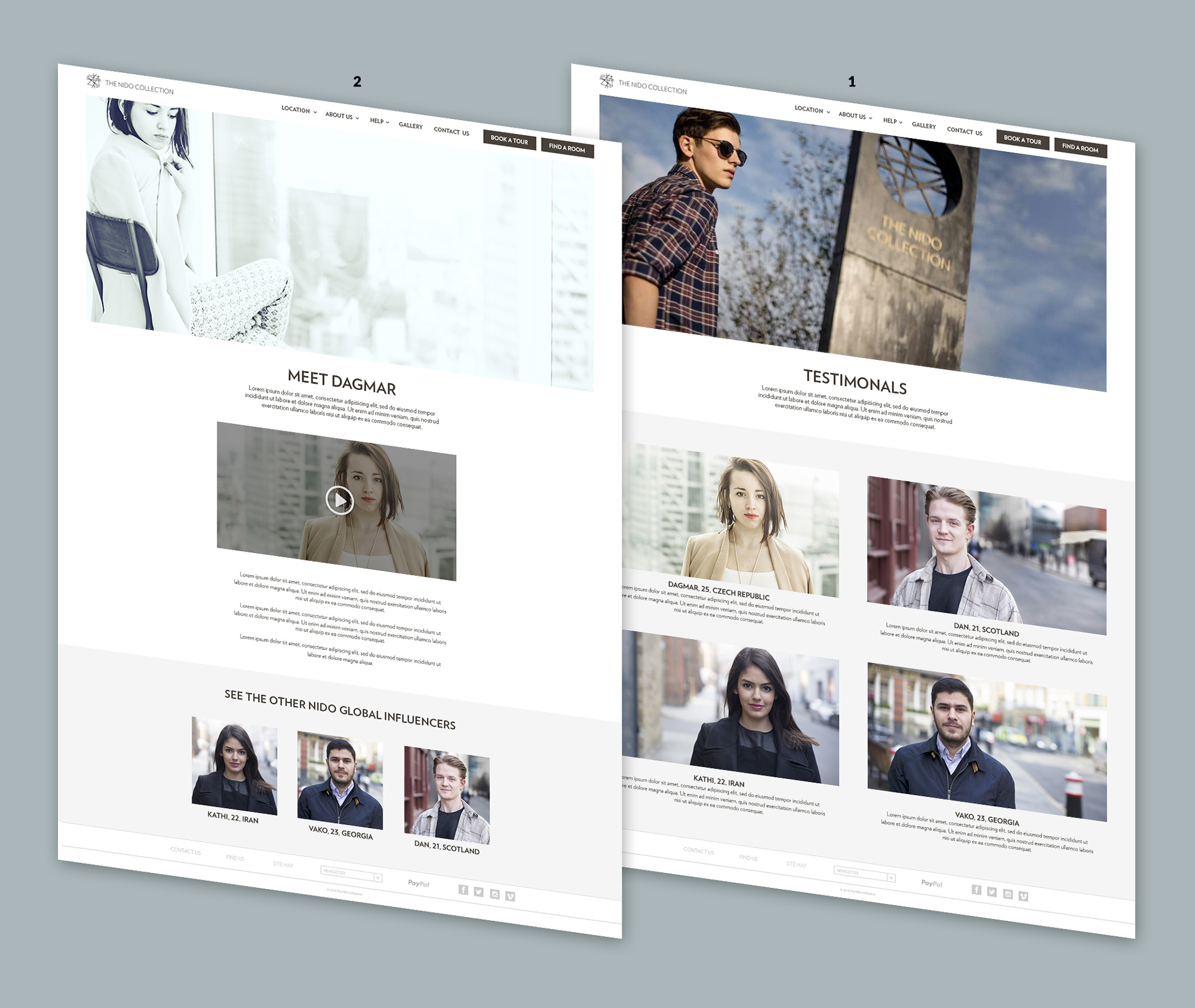
The Residents
The first page (1) follows the style of the About Us page, while the resident’s specific page (2) is made of an intro text area followed by an embed video and an html box where it’s possible to add text or images. At its bottom there is a section which shows the other residents.
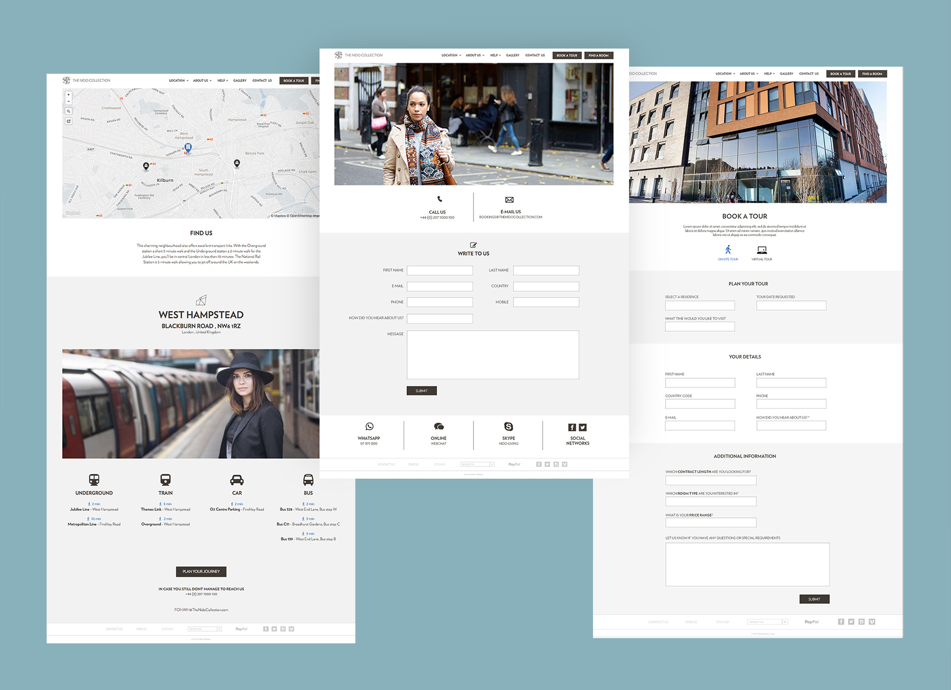
Contact us, Find us & Book a tour
These forms pages are sleek and minimal, characteristics enhanced by the use of icons whenever possible aiming to simplify the user journey.
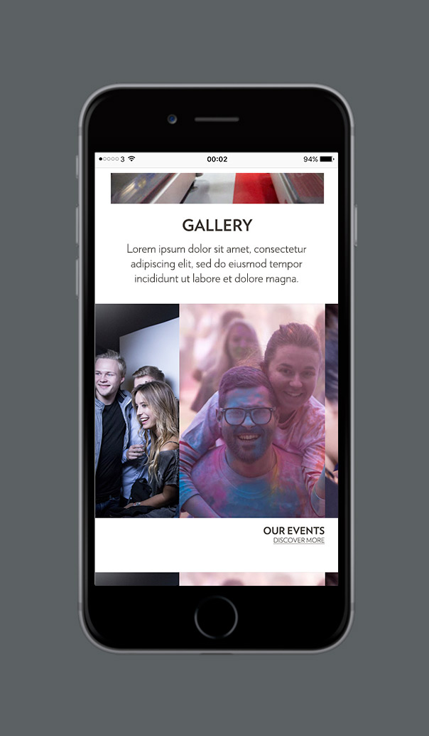
Gallery
Surely the heaviest section of the website, the gallery is a depository of all The Nido Collection images, which allows users to freely browse through it without navigating from page to page to see different images.
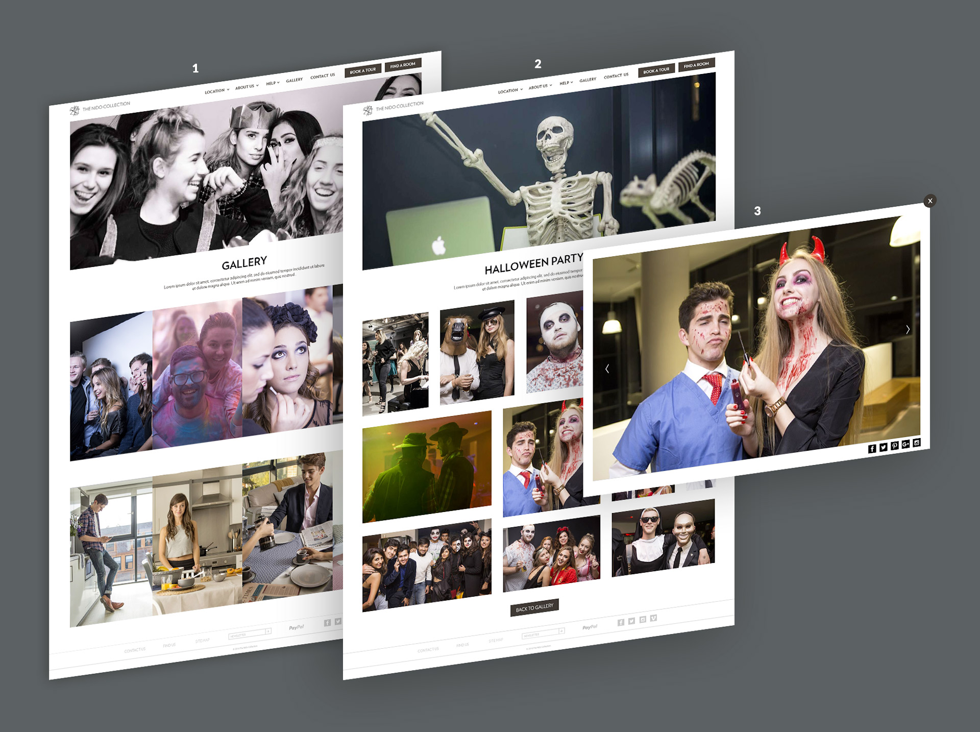
1 Image gallery
Pictures are collected in albums and in this page are shown the previews of each album through a 4 pictures carousels.
2 Album gallery
Each album photos are displayed in responsive collage which allows to see many images at the same time and to create the event atmosphere. With this solution images are unavoidably cut on the sides to favourites the particular shapes, however to see them properly it’s enough to click on them and a lightbox (3) will open showing the picture in high resolution.to see them properly it’s enough to click on them and a lightbox will open showing the picture in high resolution
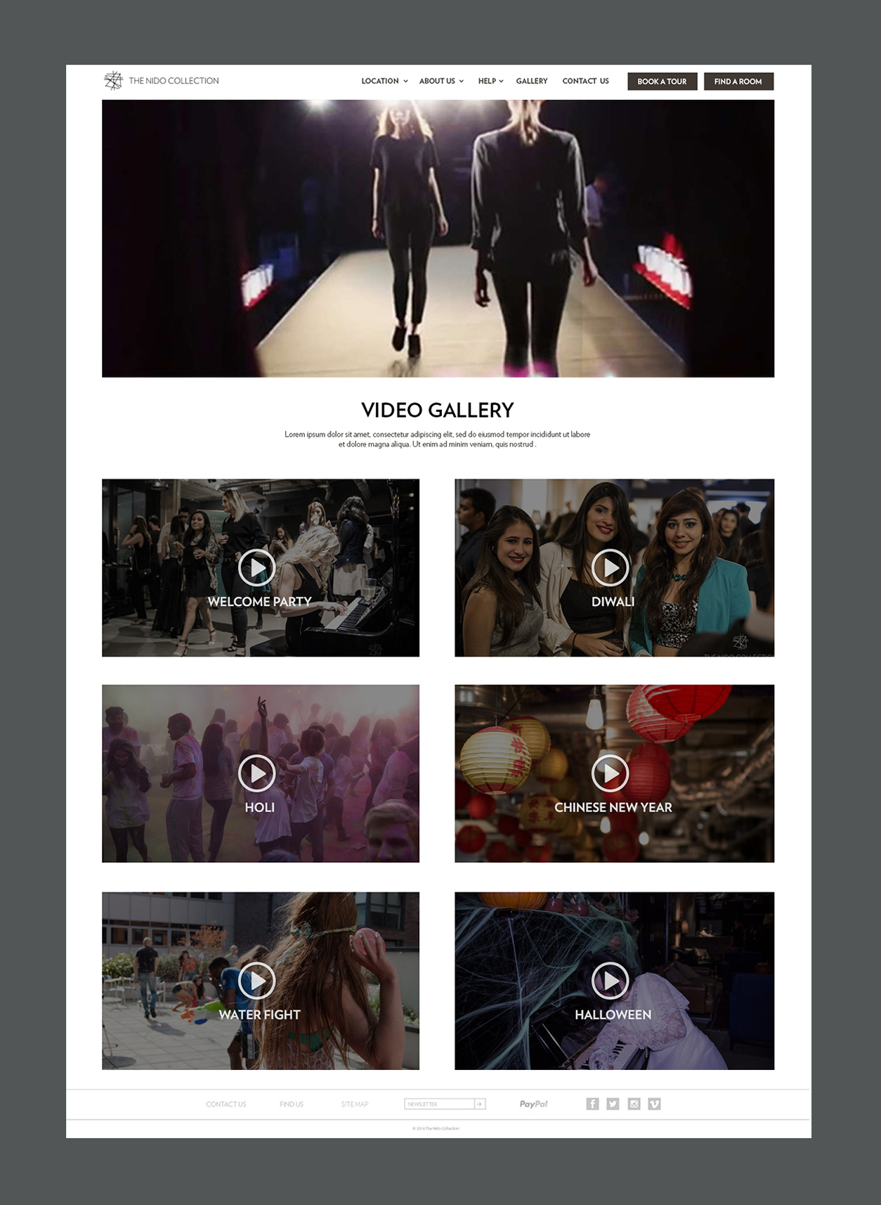
Video Gallery
The structure of this gallery is less playful than the image gallery to clearly distinguish it from the other gallery and to give to the video a look more professional and suitable for the content.