The website
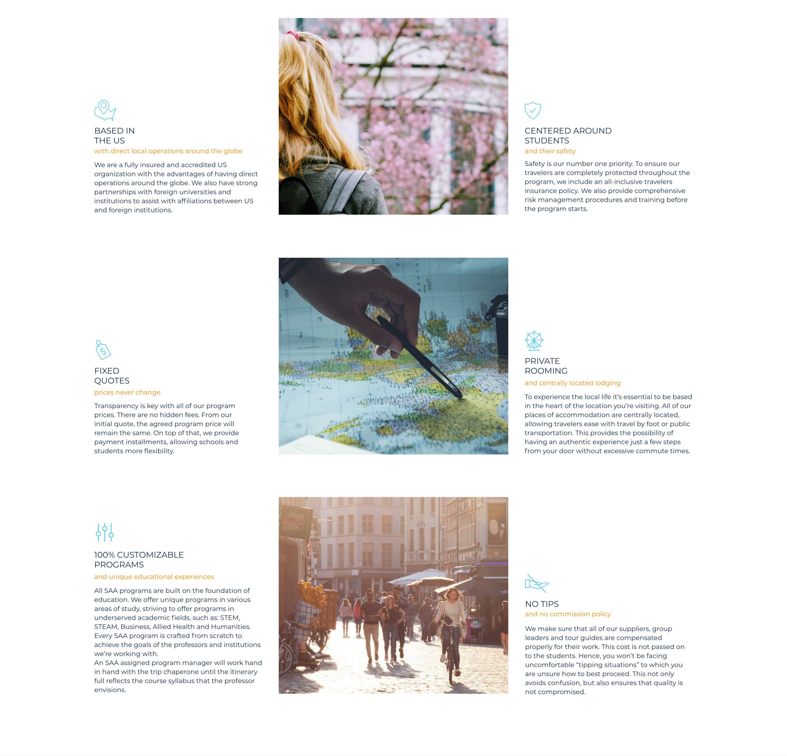
Website made in WordPress. Rich of content, it introduce the company, listing their services and all the programs they have to offer, which are possible to book via email through forms.

The sitemap
The website that I was called to redesign was pretty messy and confusing. So the first thing to do was to organise the content in a logical structure. So that users could easily navigate the website and understand the many programs the company offers. A sitemap together with the wireframes was essential to make order to the website and to discuss the structure with the client.

Wireframes

The homepage
The homepage is quite essential, presenting only a slideshow which can be interchanged depending on what wants to be promoted, a search bar and a couple of itineraries in promotion. This choice is in full contrast with their old website which had a homepage extremely rich of content, where all the programs where listed, with many itineraries and information about the company. It was overwhelming.


Programs
On this page are listed all the programs which the company offers. From there users can access the one they could be interested in. On the top navigation menu this page is accessible clicking on programs, rather than selecting a dropdown option.


Faculty-led programs
Faculty-led programs are definitely the largest section of programs (also called “itineraries” for this specific section) offered by the company. They have a large number of areas of study and destinations. Therefore this section was also one of the most laborious one.


Area of study/Destination
Users can get to an itinerary choosing either the area or study or the destination. Either way they will be brought to a page following this template.


Itinerary
Itineraries are the actual offer, the package that the user eventually will buy. So on this page are listed the details of the trip and there is the possibility to purchase it.


Other programs
The other programs are Service Learning and Lifelong Learning programs (both shown on a page following the layout on the left) and a few digital learning programs, which are listed on the page to the right.
Given the impossibility to travel due to the pandemic, the second section ended up being the most expanded by the company. So that they arrived to create a separate portal for 360 programs, which I designed and front-end coded as well: discovered360.com


Faculties and Students
The company has two targets to sell their products: faculties and students. Therefore two pages dedicated to each category, explaining what the offers are about, FAQ and other details.


About and team


Blog


Contacts and forms


Similar works:

