The old logo
In use from 1979 till early 2016.
The new proposed logo
This logo has been designed in net contrast with the (at the time) red Holmes Place logo. The harsh corners of the square are crushed by the round shape. The Serif font is replaced by a an elegant Sans Serif. While, the static, geometrical structure is destroyed by a sinuous line which divides the circle in two and connects the initials (H and P). Such dynamic effect is accentuated by the letter E crossing the edge of the circle.
Alternative colours versions
Versions to use in case of different backgrounds or just replacing the original version in some cases.
Colour Palette
As well as the logo design the colours set is in strong contrast with the bright red characterising the Holmes Place brand image at the time. This colours usually softened by a gradient effect aim to give a feeling of a luxury health club which includes spa, massages and yoga courses, rather than a “simple”, energetic red gym.
CMYK:
C: 79 M: 15 Y: 39 K: 0
RBG:
R: 10 G: 152 B: 153
CMYK:
C: 10 M: 7 Y: 7 K: 0
RBG:
R: 222 G: 223 B: 224
CMYK:
C: 0 M: 0 Y: 0 K: 75
RBG:
R: 88 G: 89 B: 91
Typeface
Three styles of Verlag are used for all the brand materials, while Asenine is the typeface used in the logo and rare occasion as “accent font”.

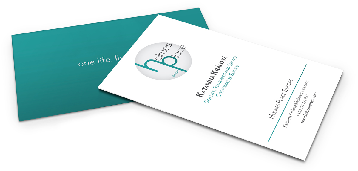
Business Cards
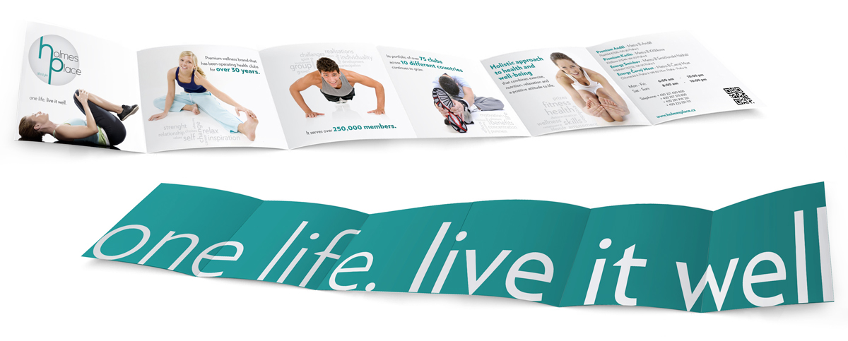
Leaflet
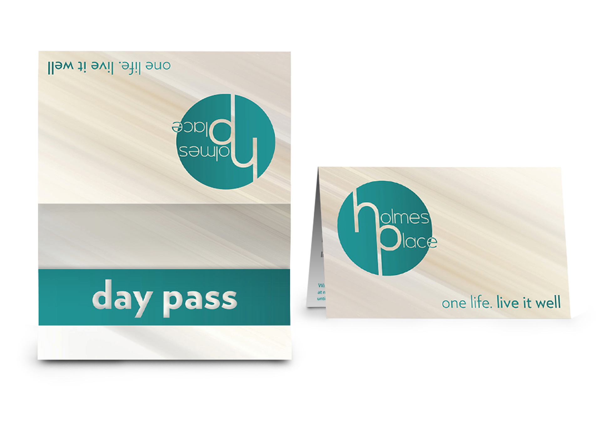
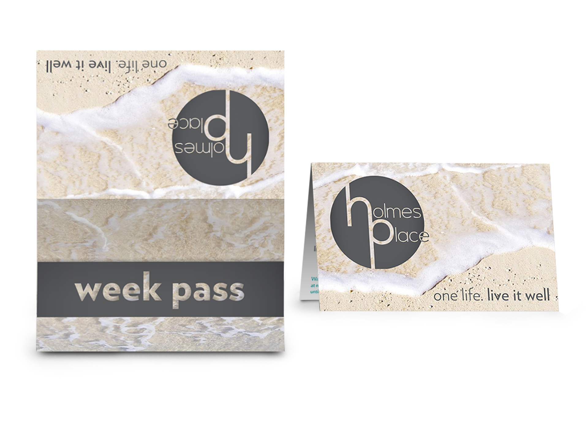
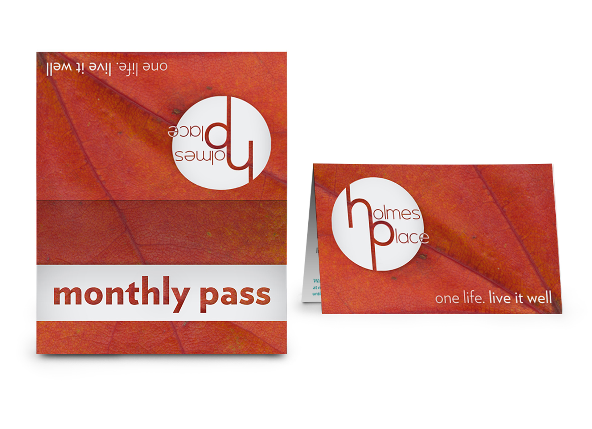
Club Cards
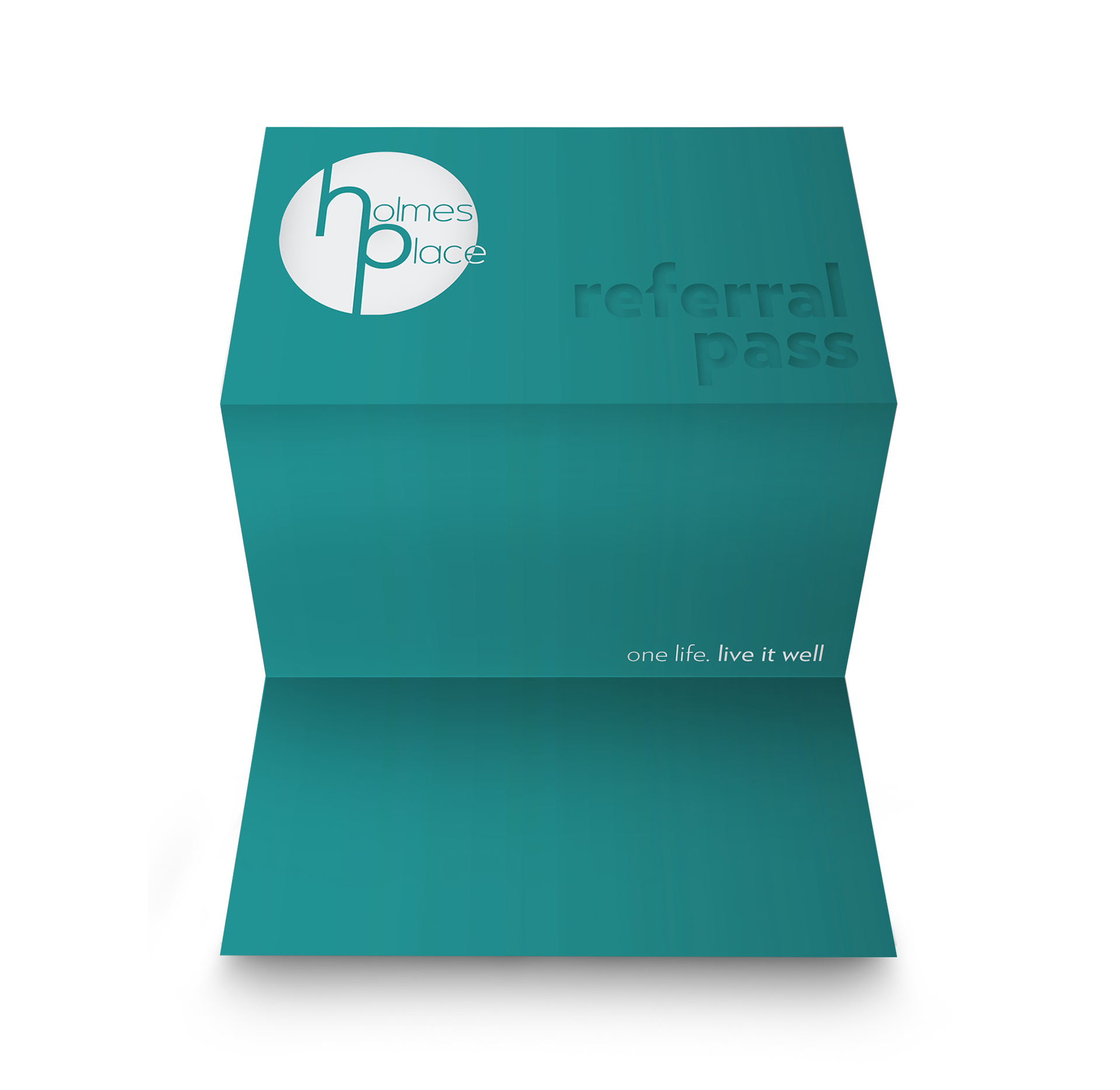
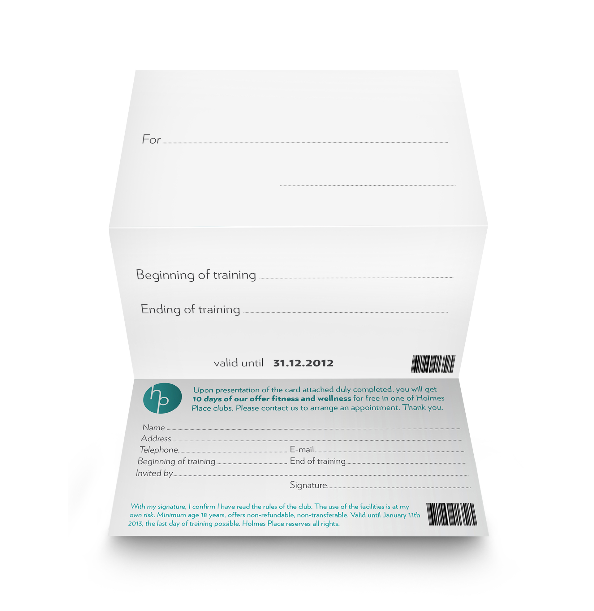
Referral Voucher
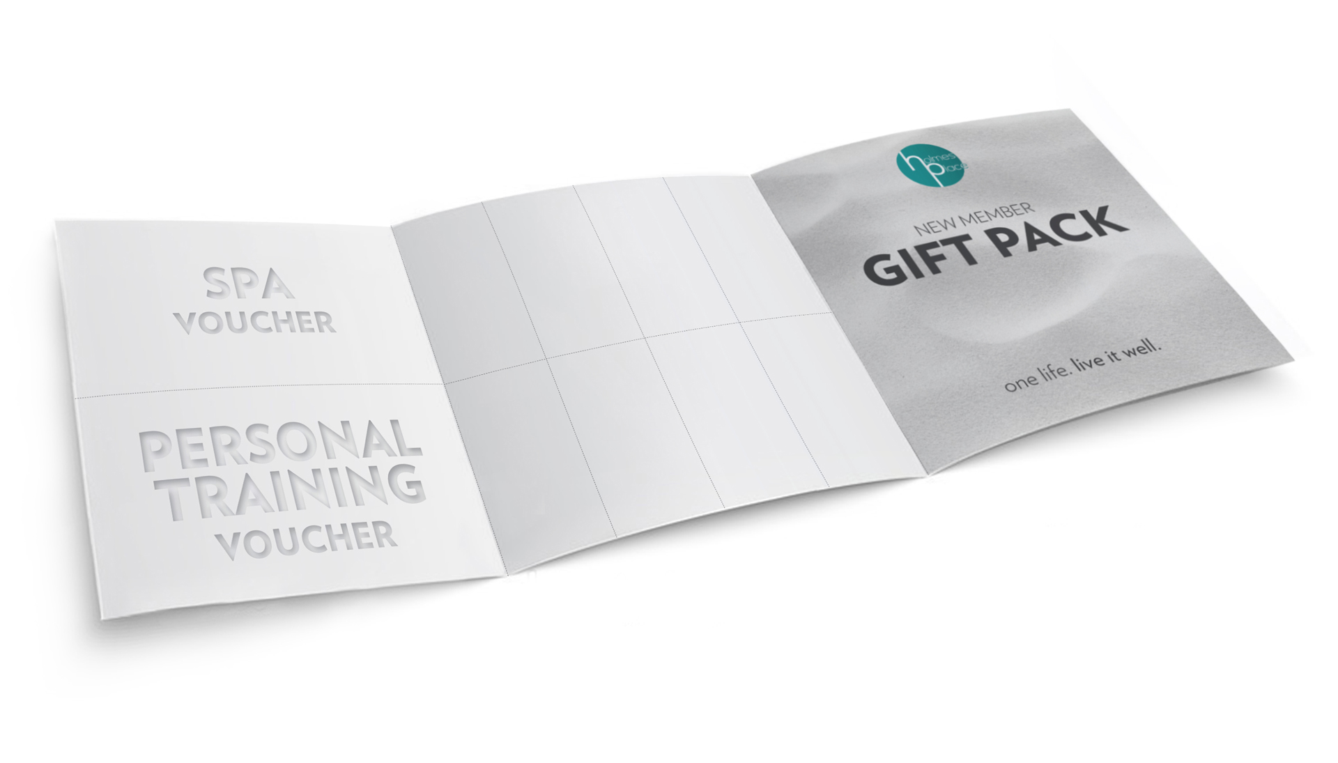
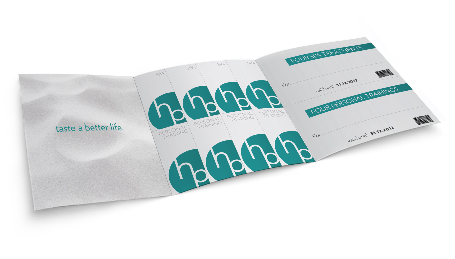
Gift Vouchers Pack