Branding for a summer music festival organised by the premium student accommodation The Nido Collection.
CLIENT: The Nido Collection
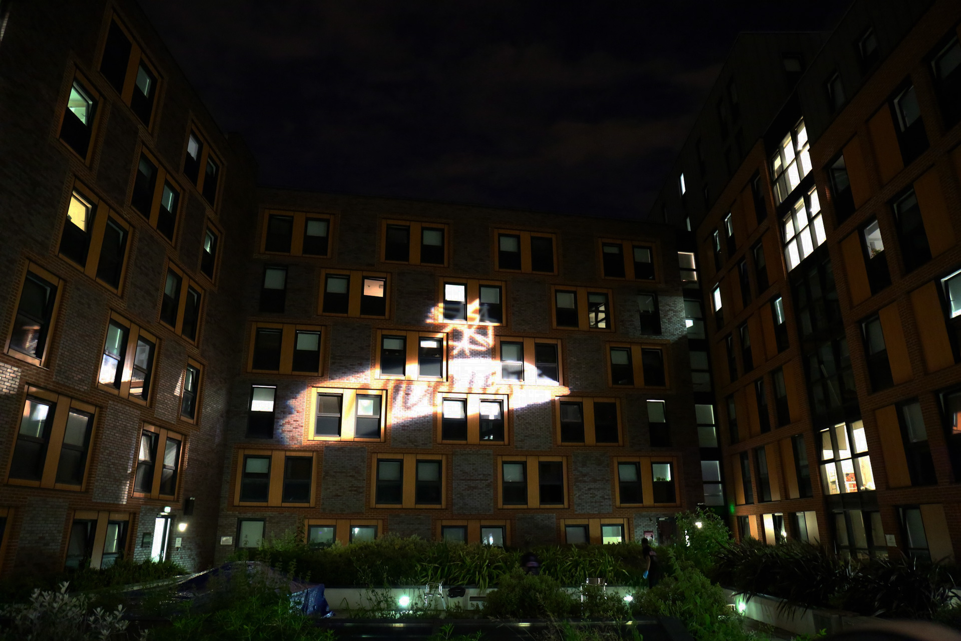
Logo Proposals
A set of logos have been proposed for the music festival of the student accommodation The Nido Collection. Besides its name (Nido Fest), also the artwork had to reveal a connection with the brand, so the “nest symbol” from The Nido Collection logo has been reworked in a sketched version sided by a handwritten/paint brush text.
Colours
Being a summer festival some lively and happy colour gradients have been proposed.
Final logo
The shape has been slightly smoothed and the year added.
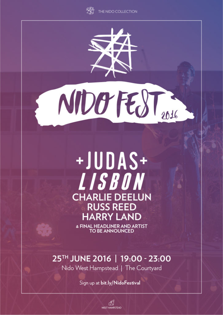
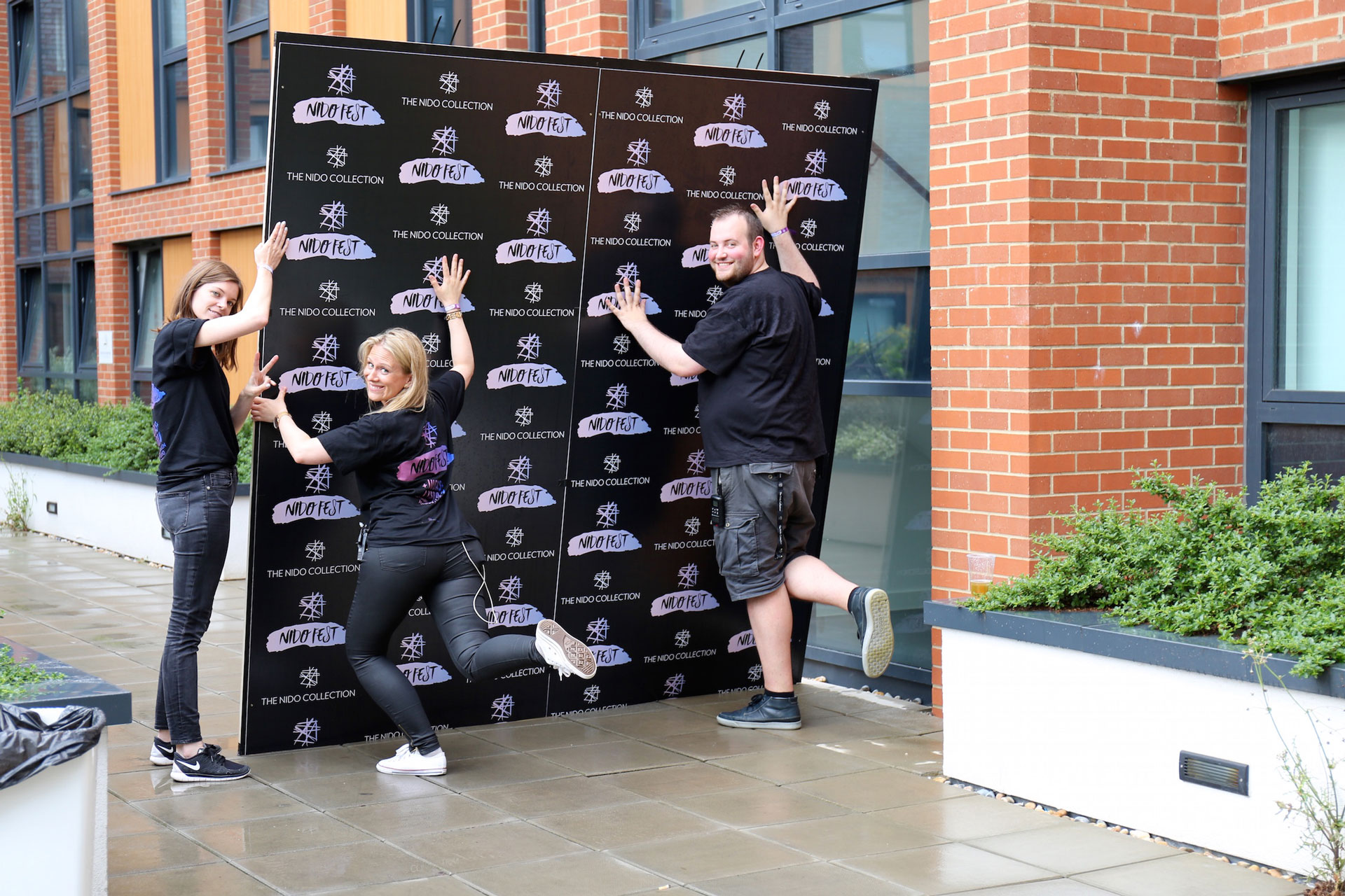
Poster
Artwork in line with all the other The Nido Collection events posters.
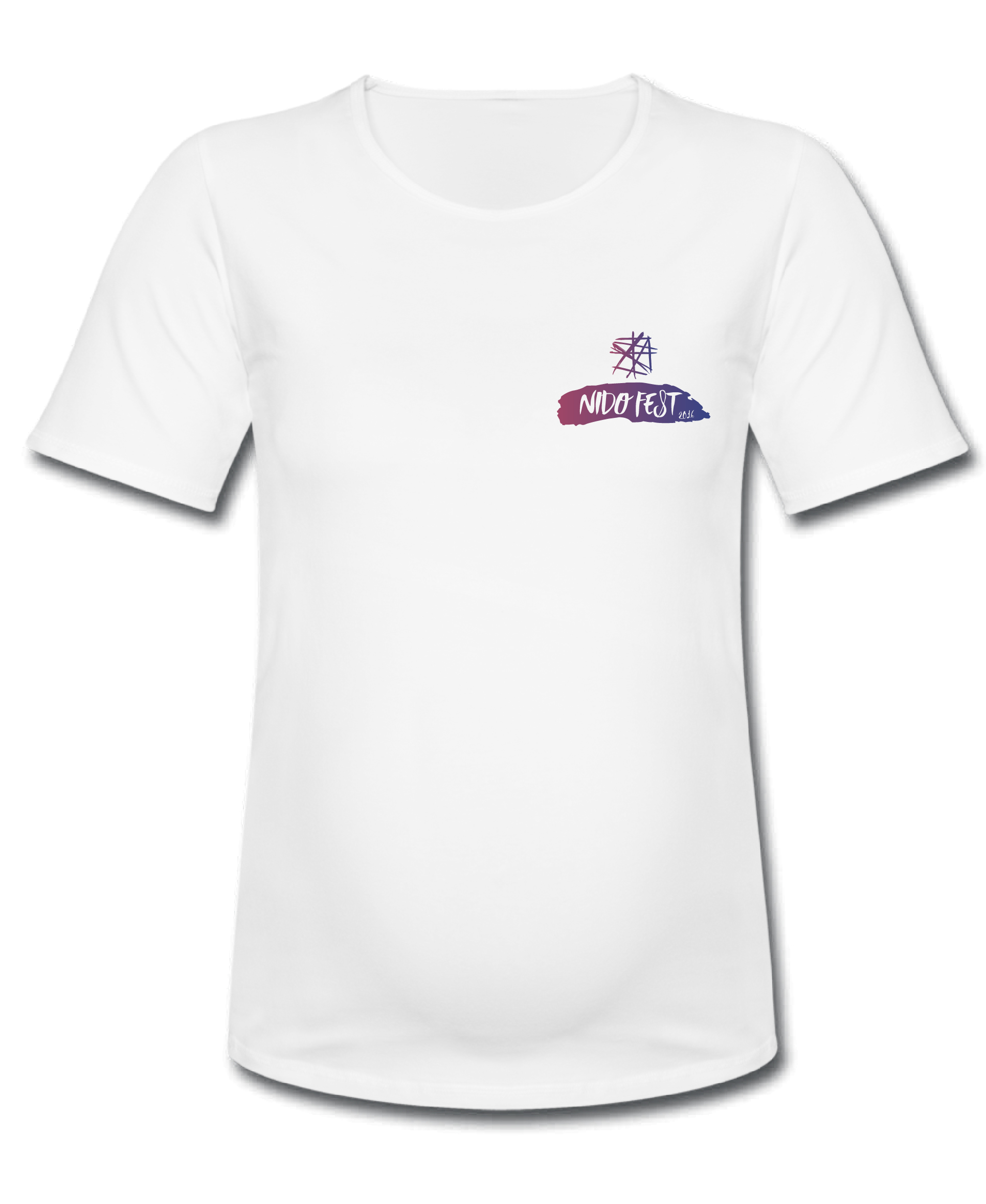
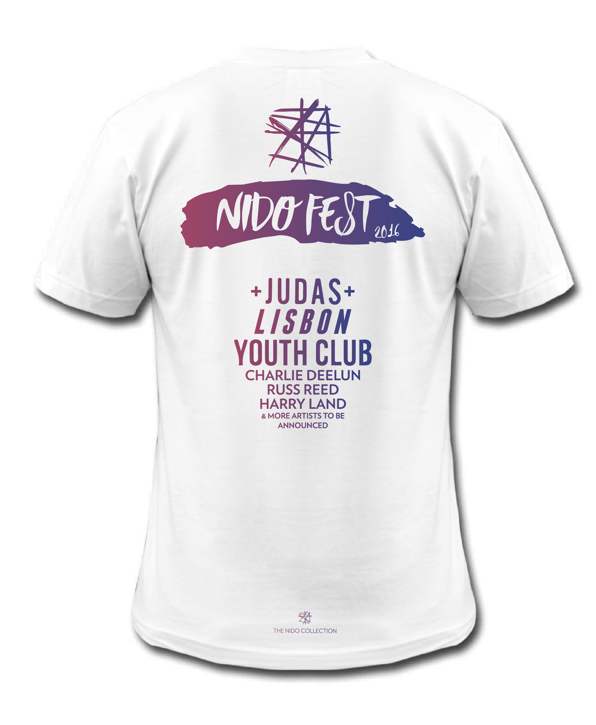
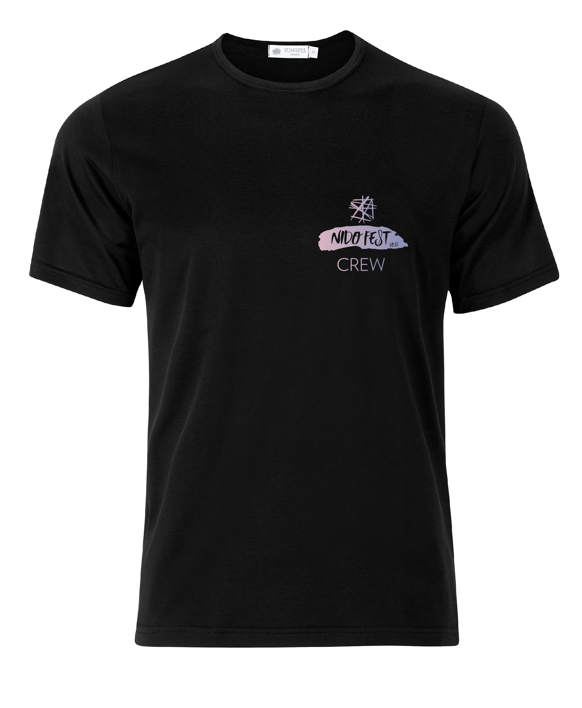
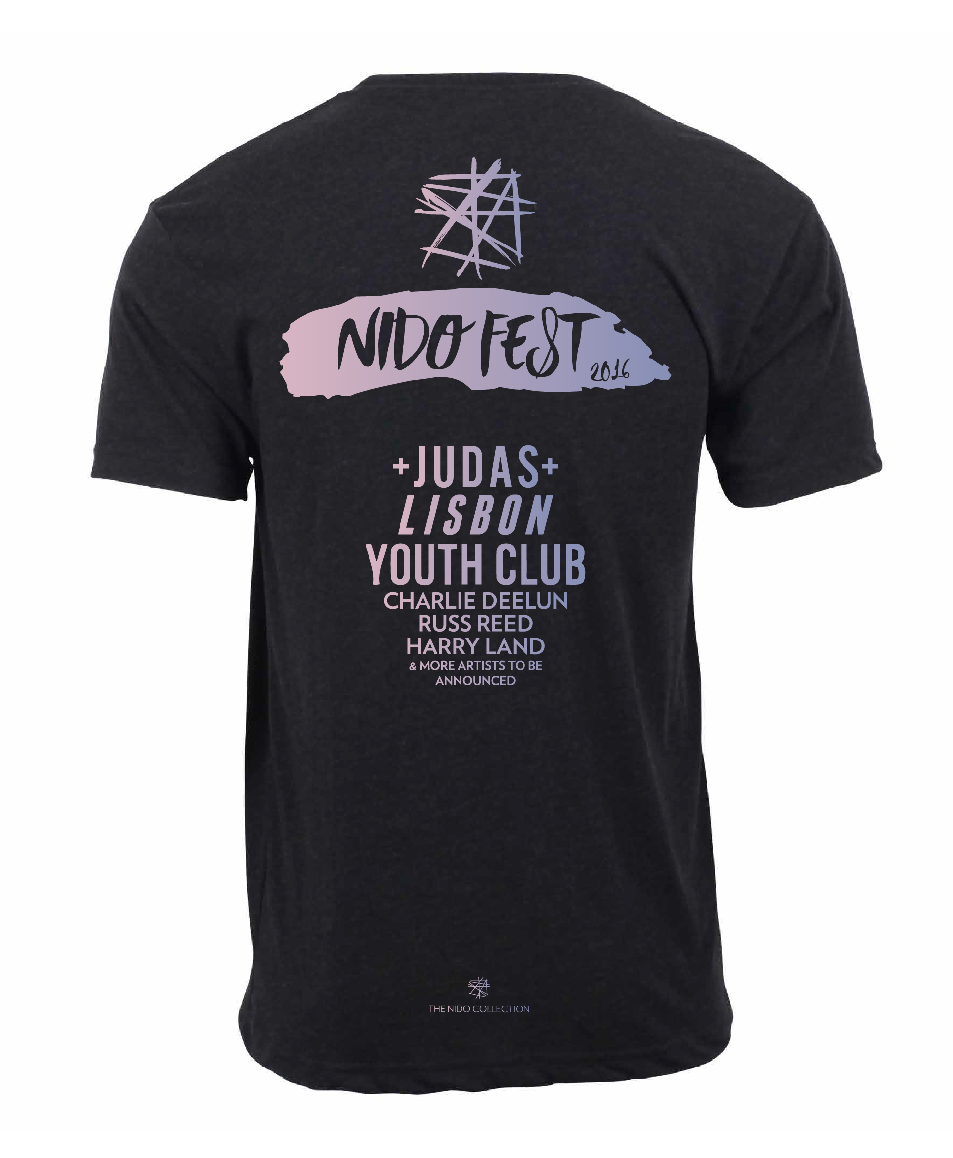
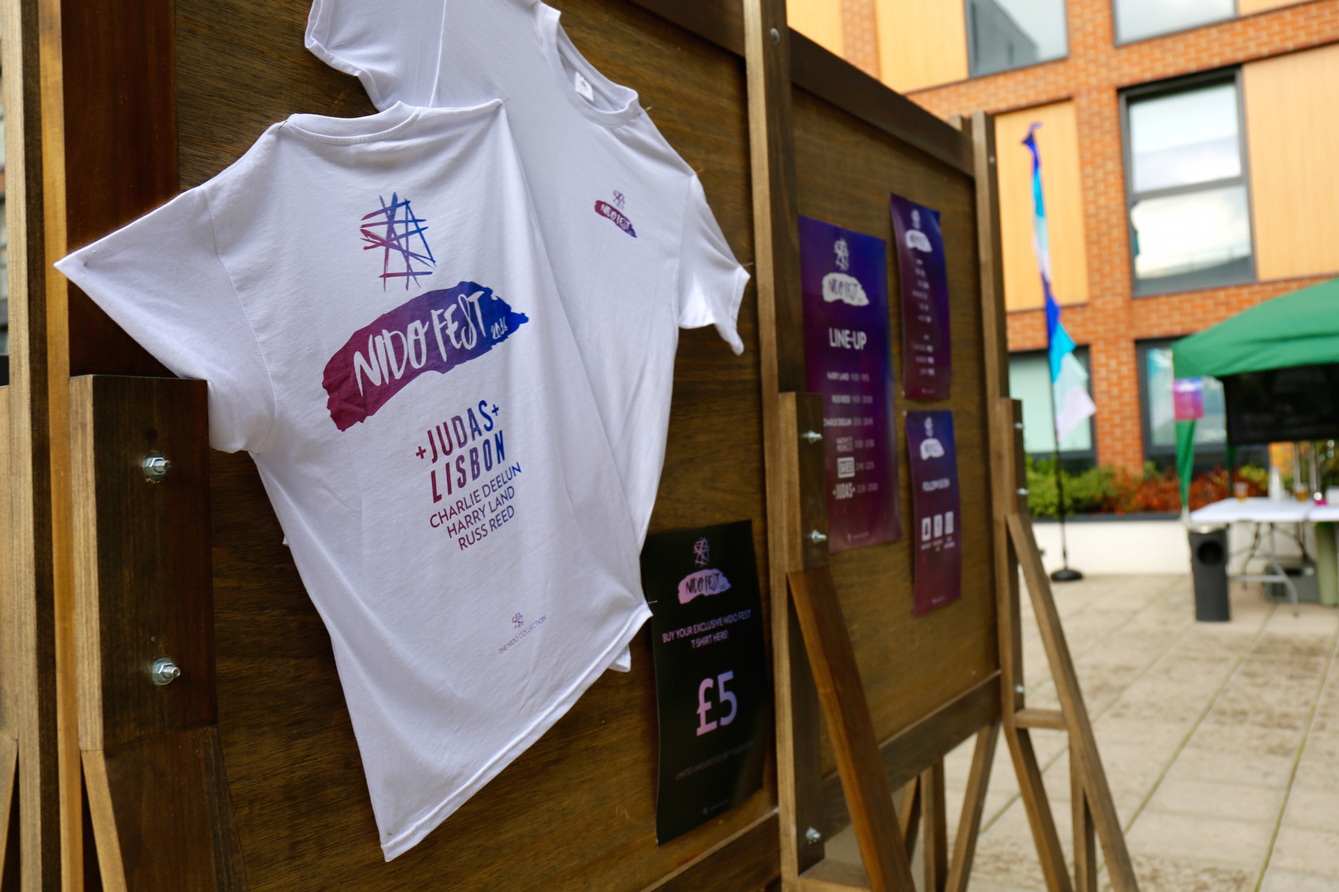
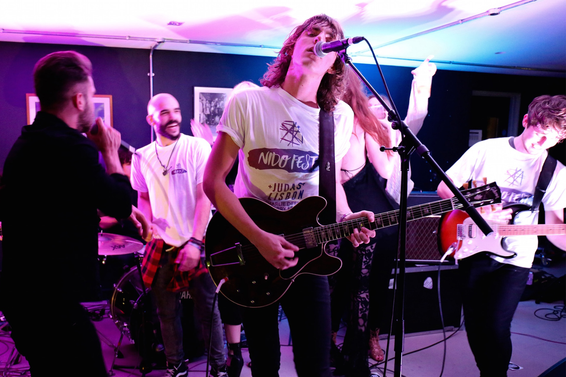
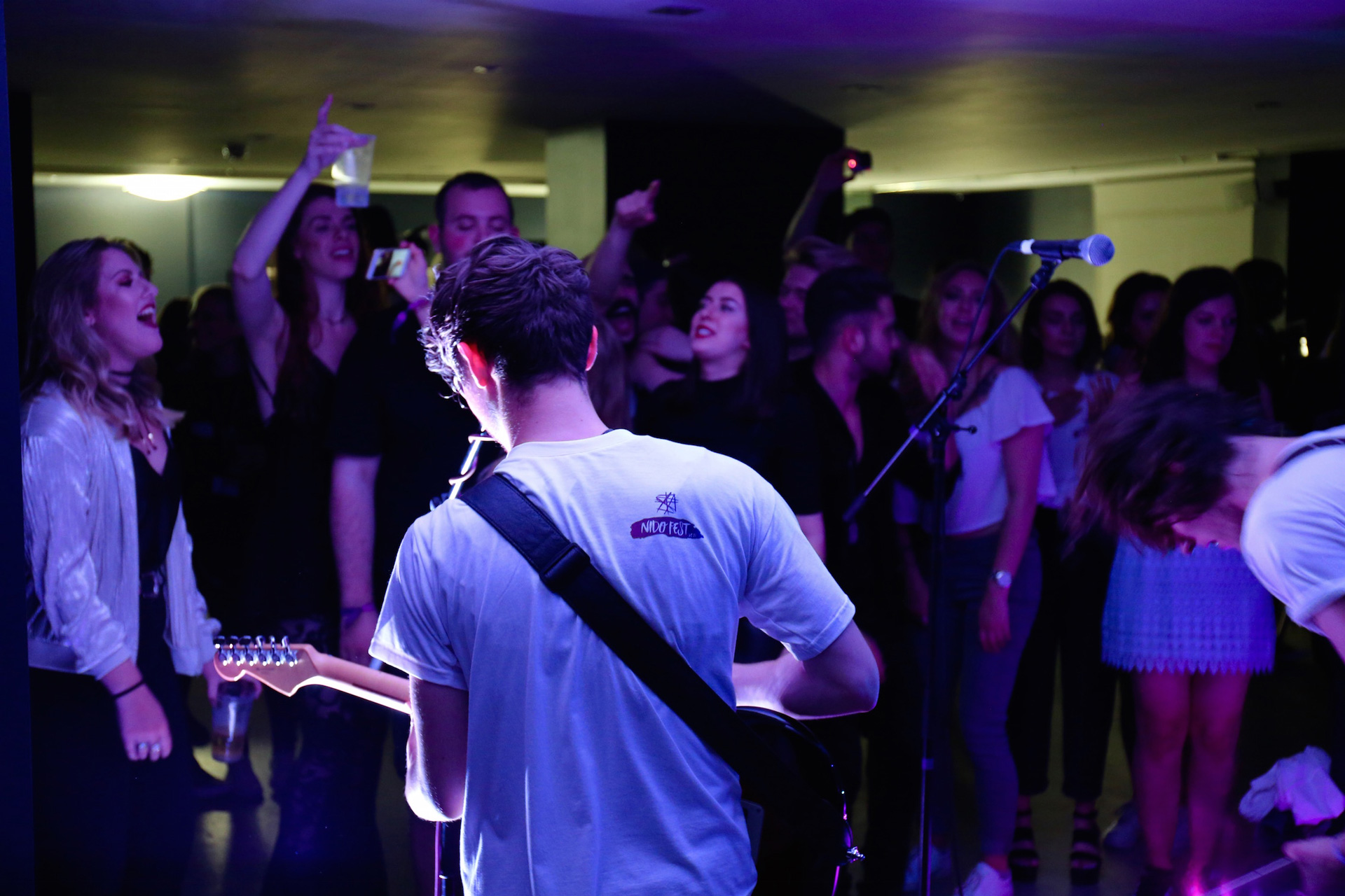
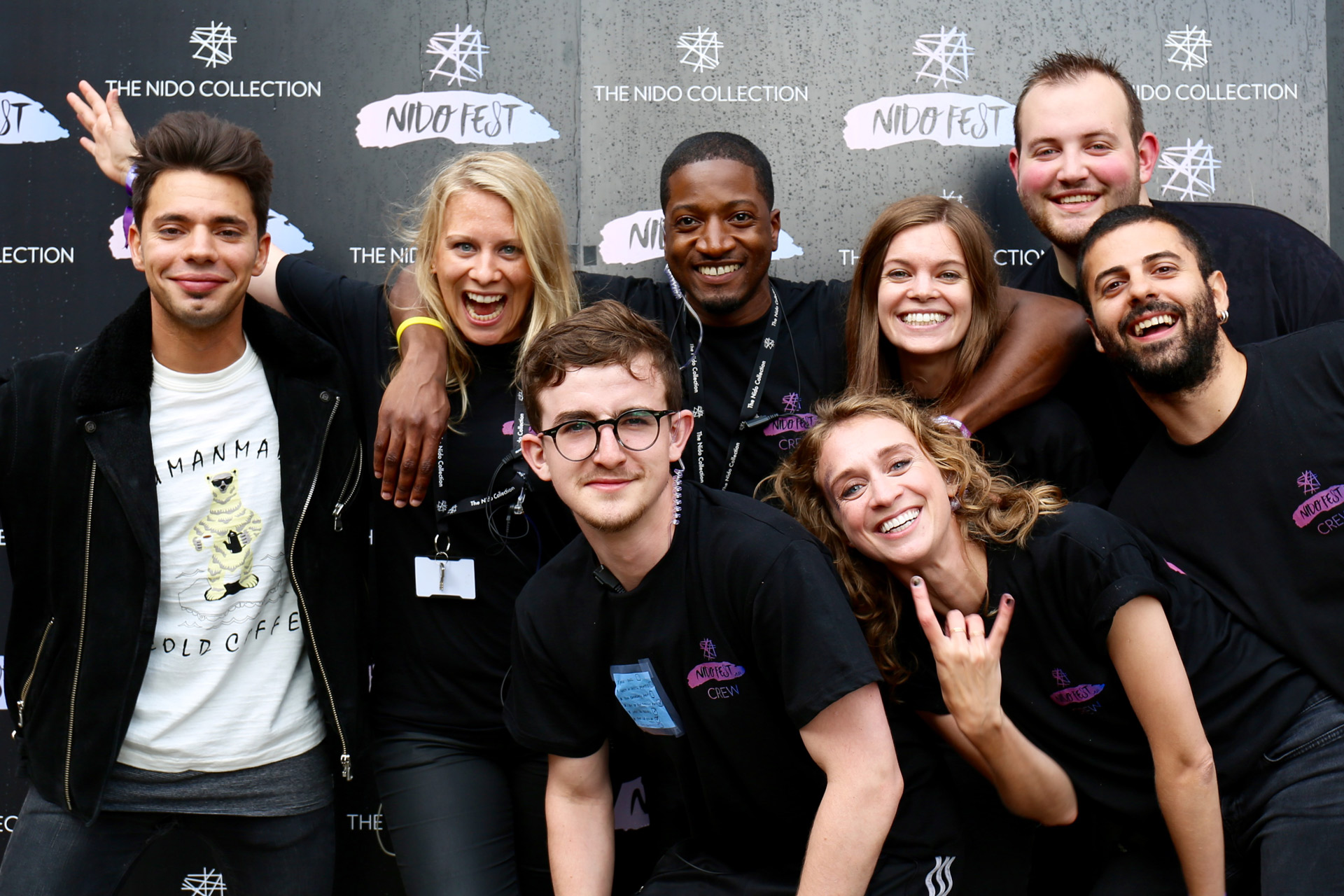
T-shirts
White t-shirt to be sold to the public and black t-shirt for the staff.
We use cookies to enhance your experience while using our website. If you are using our Services via a browser you can restrict, block or remove cookies through your web browser settings. We also use content and scripts from third parties that may use tracking technologies. You can selectively provide your consent below to allow such third party embeds. For complete information about the cookies we use, data we collect and how we process them, please check our Privacy Policy